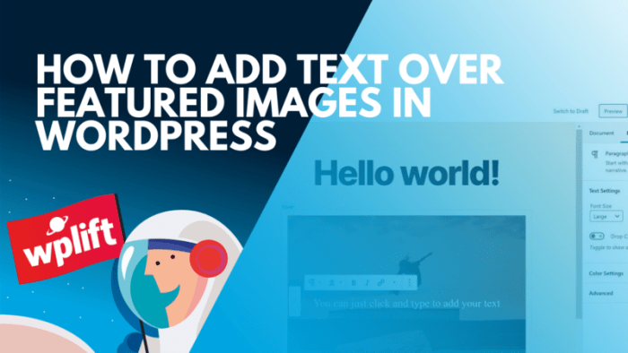
How to add text to featured image is crucial for grabbing attention and conveying information effectively. Whether you’re building a website or sharing content on social media, eye-catching featured images with text overlays can significantly boost engagement and impact. This guide explores various methods, best practices, and accessibility considerations for creating compelling visuals.
From simple captions to sophisticated call-to-actions, this comprehensive tutorial will equip you with the knowledge and techniques to elevate your featured images. We’ll cover everything from choosing the right software to crafting the perfect text placement, ensuring your images stand out and effectively communicate your message.
Methods for Adding Text to Images
Adding text to images is a common practice for various purposes, from adding captions to branding logos. This process can significantly enhance the visual appeal and convey information more effectively. Different software tools offer varying levels of ease of use and features, allowing users to choose the best option based on their needs and technical skills.Adding text to images allows for more impactful communication.
It can range from simple captions to complex graphics, making images more informative and engaging. The choice of software greatly impacts the complexity and speed of the process.
Software Tools for Adding Text to Images
Various software tools can be used to add text to images, ranging from industry-standard programs to free online resources. Choosing the right tool depends on the complexity of the task, available resources, and user proficiency.
- Photoshop: A professional image editing software, Photoshop offers extensive features for adding text to images. Its advanced typography options and precision tools allow for highly customized text placements and styles.
- GIMP: A free and open-source alternative to Photoshop, GIMP provides a powerful set of tools for image editing, including text addition. Its interface might require more learning than Photoshop but offers similar functionality.
- Online Tools: Several free online tools simplify text addition to images. These tools often have user-friendly interfaces and allow quick text placement and basic formatting. The functionality of online tools is often limited compared to desktop software.
Adding Text in Photoshop
Photoshop, known for its versatility, allows for precise text placement and customization. It’s particularly useful for complex layouts and high-quality results.
- Open the image in Photoshop. Ensure the image is loaded correctly within the Photoshop workspace.
- Select the “Type Tool” (T). This tool is specifically designed for adding text to images.
- Click on the image where you want to position the text. A text box will appear.
- Type the desired text within the text box. Adjust the font, size, color, and other formatting options using the various tools available in the Photoshop interface.
- Once satisfied with the text placement and formatting, click outside the text box to finalize the changes.
Adding Text Using an Online Tool
Online tools provide a user-friendly alternative for simple text additions. They are particularly convenient for quick tasks or when desktop software is unavailable.
- Open a web browser and navigate to a free online image editor. Several such tools are readily available.
- Upload the image you wish to add text to. This usually involves clicking a button or drag-and-drop functionality.
- Select the “text” or “add text” option. This will usually bring up a text box.
- Enter the text you want to add and adjust font, size, color, and alignment as needed. These options are typically located in a toolbar above the text box.
- Position the text on the image and click “save” or a similar option to save the edited image.
Comparison of Software Tools
The following table summarizes the key differences between the discussed software tools.
| Software Tool | Cost | Features | User Interface |
|---|---|---|---|
| Photoshop | Paid | Extensive, including advanced typography, layers, and editing options | Complex, but highly customizable |
| GIMP | Free | Powerful, comparable to Photoshop, but with a steeper learning curve | Intuitive, but not as user-friendly as Photoshop |
| Online Tools | Free | Basic, primarily for simple text additions | User-friendly, easy to use, and often web-based |
Best Practices for Text Overlays: How To Add Text To Featured Image
Adding text to images is a powerful way to convey information and enhance visual appeal. However, simply slapping text onto an image isn’t enough for a professional result. Effective text overlays require careful consideration of design principles to ensure clarity, readability, and visual harmony. This section explores the best practices for creating impactful and visually appealing text overlays.Effective text overlays enhance visual communication and elevate the overall impact of an image.
By adhering to design principles and considering the elements of font selection, size, color, and contrast, designers can ensure their text overlays effectively support the message and complement the image.
Font Selection and Readability
Font selection significantly impacts readability and overall aesthetic appeal. Choosing the right font can make text easily digestible, while an inappropriate choice can hinder comprehension and detract from the visual impact. Consider the context of the image and the message it aims to convey. A clean, sans-serif font might work well for modern, minimalist designs, while a serif font might be more appropriate for traditional or formal themes.
The font should complement the image’s style and not clash with the overall design. Avoid using overly decorative or complex fonts that can make the text hard to read. Prioritize legibility over aesthetics when choosing a font.
Font Size and Color Choices
Font size and color choices are crucial for readability and visual appeal. The font size should be large enough to be easily read from a distance but not so large that it overwhelms the image. The color of the text should contrast sufficiently with the background color to ensure clarity. A high contrast between text and background improves readability, particularly for users with visual impairments.
Test different font sizes and colors against various background images to determine the optimal combination for clarity and visual impact.
Maintaining Clear Contrast
Maintaining a clear contrast between the text and the image background is essential for readability. Use a color palette that provides sufficient visual separation. Tools like online contrast checkers can assist in determining the contrast ratio between the text color and the background color. A high contrast ratio ensures that the text is easily visible against the background, regardless of the viewing conditions.
This practice improves accessibility for all users. It’s crucial to test the contrast against different background images and lighting conditions to ensure optimal readability.
Illustrative Table of Font Combinations
| Font | Font Size | Color | Background Image | Visual Impact |
|---|---|---|---|---|
| Open Sans | 24px | #333 | Image with a light-gray gradient | Good readability, subtle, and modern |
| Roboto | 18px | #FFF | Image with a dark-blue background | Excellent contrast, sharp, and clear |
| Times New Roman | 20px | #000 | Image with a muted orange background | Good readability, but could be improved |
This table demonstrates the importance of careful font combination choices. Different combinations can have different visual impacts, emphasizing the need to test and evaluate various options before making a final decision.
Text Placement and Layout Strategies
Adding text to images effectively hinges on thoughtful placement and layout. A well-positioned text overlay enhances the visual appeal and clarity of the image, while a poorly placed one can detract from the overall message. Strategic use of alignment, spacing, and text box design are crucial for creating a polished and engaging image. Consider the intended message and target audience when making these decisions.A well-considered approach to text placement will ensure the text complements the image, rather than competing with it.
The interplay between text and image should be harmonious, guiding the viewer’s eye and enhancing understanding. Achieving this balance requires careful consideration of various layout strategies.
Text Alignment Options
Different alignment options for text provide diverse visual impacts. Left alignment is commonly used for straightforward text blocks, while center alignment can create a more balanced and visually appealing layout, particularly suitable for short titles or captions. Right alignment is often employed for emphasis or to visually separate text from other elements. Justified alignment, though visually appealing in some contexts, can sometimes disrupt the natural flow of the text and potentially cause uneven spacing, impacting readability.
Consider the context of the image and the message to be conveyed when choosing the appropriate alignment.
Spacing and Margins for Readability
Proper spacing and margins are essential for enhancing readability. Adequate spacing between lines of text (line height) and between the text and the image border (margins) prevent the text from appearing cluttered or overwhelming. Adjusting these elements allows for a more comfortable reading experience, avoiding eye strain and ensuring that the viewer can easily comprehend the text. Consider the font size and style when determining appropriate spacing to maintain a clear visual hierarchy.
Impact of Text Box Shapes and Sizes
The shape and size of the text box significantly influence the overall design. Rectangular boxes are the most common and versatile, but other shapes like rounded rectangles, squares, or even custom shapes can add a unique visual touch. The size of the text box should be proportionate to the image and the amount of text. A large text box might overshadow the image, while a small one might make the text hard to read.
Experiment with different sizes and shapes to find the best fit for the specific image and message.
Adding text to your featured image can be a snap, but sometimes it’s tricky to get it just right. For example, if you’re creating a blog post about eco-friendly initiatives like the 2 of 52 San Francisco green film , you want the image to clearly convey the message. Fortunately, various tools make it simple to overlay text on your images, ensuring your visuals are as informative as they are appealing.
Just remember to keep the text concise and easy to read.
Tips for Creating Effective Text Overlays
Here are some practical tips for creating text overlays that complement the image context:
- Consider the image’s subject matter and theme when choosing the text’s style and content.
- Ensure the text is legible and easy to read, considering the image’s background and font size.
- Use a font that complements the image’s style and enhances the overall visual appeal.
- Avoid using too much text; prioritize clarity and conciseness.
- Test the overlay on different devices and screen sizes to ensure optimal readability and visual appeal across various platforms.
Accessibility Considerations

Adding text to images can significantly enhance visual communication, but it’s crucial to consider the needs of all users, particularly those with visual impairments. Accessibility ensures that everyone can understand and interact with the content, fostering inclusivity and broadening the reach of your message.Effective text overlays must be designed with accessibility in mind. This involves more than just placing text on an image; it requires careful consideration of font choices, contrast ratios, and alternative text descriptions.
This section will delve into the importance of these elements and how to implement them for maximum accessibility.
Importance of Accessible Text Overlays
Accessible text overlays are vital for ensuring inclusivity. Users with visual impairments often rely on assistive technologies like screen readers to perceive information presented visually. These technologies can interpret and convey the content of text overlays to users, enabling them to understand the message conveyed.
Making Text Overlays Accessible
To make text overlays accessible, several crucial aspects need attention. Prioritizing sufficient contrast between the text and the background image is paramount. Screen readers rely on these visual cues to convey information accurately.
Font Choices and Contrast Ratios
Font choices directly impact readability. Sans-serif fonts, like Arial or Helvetica, are often preferred for their clarity, especially on images. Avoid overly decorative or complex fonts, as these can hinder comprehension. A crucial consideration is the contrast ratio between the text color and the background. WCAG (Web Content Accessibility Guidelines) recommends sufficient contrast ratios for optimal readability by assistive technologies.
For example, a text color of #FFFFFF (white) on a dark background (#000000 – black) provides excellent contrast, but a lighter background may require a different color to meet the standards.
Alt Text for Images with Text Overlays
Alt text (alternative text) provides a textual description of the image for screen readers and other assistive technologies. When text is added directly to an image, the alt text should describe the entire image, including the text overlay. For example, if an image shows a product with a label, the alt text should describe the product, and the label’s content.
This is crucial for users relying on screen readers.
Examples of Accessible Text Overlays
Consider an infographic visualizing sales data. A properly accessible overlay would use clear, concise text in a sans-serif font. The text color would have a sufficient contrast ratio against the infographic’s background. The alt text would accurately describe the infographic’s content, including the data and the labels on the chart.Another example is a photo of a building with a caption identifying its architectural style.
The alt text would describe the building’s appearance, including the architectural details and the caption’s content.
Summary of Accessibility Guidelines for Image Text
| Guideline | Description |
|---|---|
| Sufficient Contrast | Ensure text color has a sufficient contrast ratio against the background image. |
| Clear Font Choices | Use clear, legible fonts (e.g., sans-serif) and avoid decorative fonts. |
| Comprehensive Alt Text | Provide a detailed description of the image, including the text overlay, for screen readers. |
| WCAG Compliance | Adhere to Web Content Accessibility Guidelines (WCAG) recommendations. |
Examples and Case Studies

Effective text overlays transform ordinary images into engaging visual narratives. They capture attention, convey information concisely, and enhance the overall user experience. By carefully considering placement, font choices, and the image itself, designers can create impactful visuals that resonate with their target audience. A well-placed text overlay can elevate a simple photograph into a powerful marketing tool or a compelling piece of educational content.Understanding successful text overlays requires examining both effective and ineffective implementations.
Analyzing examples provides valuable insights into the principles of good design, while recognizing poor examples helps avoid common pitfalls. This exploration will cover diverse contexts, highlighting the impact of text overlays on engagement and brand identity.
Effective Text Overlay Examples
Effective text overlays often prioritize clarity and conciseness. They use legible fonts, appropriate font sizes, and strategically placed text to ensure the message is easily understood. The following examples showcase different approaches to text overlays in various contexts:
- A travel blog post featuring a breathtaking mountain vista might use a text overlay with a concise caption highlighting the location and a call to action encouraging readers to book their trip.
- A product photography website could feature a close-up image of a gadget with text overlays describing key features and benefits. This might include a short, impactful description of the product and its functionalities, using a font that contrasts with the image.
- An educational website displaying a chart could utilize a text overlay to label axes and provide clear explanations of data points. The overlay would need to be unobtrusive and not overwhelm the chart’s visual representation.
Examples of Poor Text Placement
Poorly placed text overlays can significantly detract from an image’s impact. This is often due to poor readability or distracting layouts. Examples of poor text placement include:
- A photograph of a vibrant city street with text overlayed in a small, light-colored font that is difficult to read against the busy background.
- A product image with text overlayed directly on the product’s most important features or details. This can obscure the product and detract from its visual appeal.
- A complex infographic with multiple, overlapping text overlays. This can lead to a cluttered and confusing visual experience for the viewer.
Impact of Well-Designed Text Overlays
Well-designed text overlays can significantly increase user engagement and conversion rates. This is especially true when the overlays align with the overall brand identity. Real-world examples demonstrate this impact.
Adding text to your featured images is crucial for SEO, but it’s also important to remember that website redesigns or migrations can seriously impact your search engine rankings. Luckily, there are strategies to mitigate that risk, like the ones outlined in this helpful article about 3 keys to redesigning or migrating your site without killing your SEO.
By following these steps, you can ensure a smooth transition while maintaining your online visibility. Ultimately, adding descriptive alt text to your featured images is still key to getting those images to rank higher.
- A fashion brand featuring an image of a model in a new collection with text overlays that clearly identify the garments and their pricing can see a significant rise in online sales. The carefully placed text overlays provide clarity and encourage viewers to make purchases.
- A social media post using an image of a positive customer experience with clear and concise text overlaying testimonials can lead to an increase in engagement metrics, including shares and comments. The user is encouraged to connect with the brand on an emotional level.
Aligning Text Overlays with Brand Identity
Maintaining consistency in visual elements is key to building a strong brand identity. Text overlays should reflect the overall brand aesthetic, including color palettes, typography, and style.
- A company with a modern, minimalist brand identity would benefit from using clean, sans-serif fonts and a limited color palette in its text overlays. The design should not overwhelm the image, but complement it.
- A company with a more playful, vibrant brand identity might use bold, colorful fonts and playful text placements to create a sense of excitement. The chosen style should reinforce the brand’s overall message and personality.
Diverse Text Overlay Styles
Various text overlay styles can be implemented to achieve different visual effects. The choice of style depends on the context and the intended message.
- A simple, single line of text placed subtly over an image to add a tagline or brief description. This is ideal for conveying concise information.
- Multiple lines of text placed strategically over an image to elaborate on the image’s details. This works well for product or blog post descriptions.
- A combination of colors, fonts, and sizes to create a dynamic and engaging effect.
Advanced Techniques
Pushing beyond basic text overlays, advanced techniques unlock a wider range of creative possibilities for integrating text into images. These methods often involve more intricate design considerations and technical expertise, but the results can be truly impactful, creating visual experiences that are both striking and memorable. Mastering these techniques allows for a higher level of control over the visual hierarchy and aesthetic appeal of the final image.
Masking for Precise Text Placement
Masking techniques provide a powerful way to precisely position text within an image, ensuring it seamlessly integrates with the existing design elements. By using masks, you can create custom shapes for the text boxes, allowing the text to follow the contours of the image or other design elements. This approach offers a high degree of flexibility and control, giving designers the ability to achieve unique and sophisticated results.
- Creating custom shapes: Software tools like Photoshop and GIMP offer masking tools that enable the creation of custom shapes for text boxes. These shapes can be intricate and complex, allowing for a more organic and artistic integration of text into the image. For instance, a mask could be shaped like a leaf, allowing text to flow along the leaf’s contours, or a stylized geometric form to accentuate a specific area of the image.
- Clipping masks: Clipping masks in image editing software are used to confine text to a specific area or shape within the image. This ensures the text is visible only within the defined area, while the rest of the image is hidden, providing a focused and clean visual presentation. For example, text can be placed within a curved shape drawn on the image itself, and only the text within that shape will be displayed.
- Alpha channels: Manipulating alpha channels allows for greater control over transparency and text visibility, making text more integrated with the background and achieving subtle visual effects. This technique allows the text to blend seamlessly with the image, making it appear as if the text was an inherent part of the image, rather than a superimposed element.
Vector Graphics for Text Overlays
Vector graphics offer advantages in terms of scalability and resolution independence. When used for text overlays, vector graphics ensure the text maintains crispness and clarity at any size, without pixelation or distortion. This is particularly valuable for images that may be used in various sizes and formats across different media.
- Scalability: Vector graphics are resolution-independent, meaning the text can be scaled up or down without losing quality. This is a key advantage when working with images that may be used in different contexts or sizes, such as logos, posters, or website banners.
- Editability: Vector graphics are editable, allowing for easy adjustments to the text size, font, and color. This makes it simpler to modify the overlay to better suit the overall design, as opposed to raster images where changes can lead to loss of quality.
- Integration: Vector graphics can be seamlessly integrated into other vector-based design elements, creating a unified and coherent visual aesthetic. This integration allows for consistent visual themes throughout a design project, ensuring a unified visual experience.
Comparison of Techniques
Different text overlay techniques offer unique advantages and disadvantages. The best approach depends on the specific needs of the project and the desired visual outcome.
Adding text to your featured image is a straightforward process, but safeguarding your content is equally important. For instance, understanding how to properly attribute your work, and using tools like digital plagiarism detection content protects business is crucial in today’s digital landscape. Ultimately, this ensures your hard work isn’t misappropriated and helps maintain the integrity of your blog’s content.
| Technique | Advantages | Disadvantages |
|---|---|---|
| Masking | Precise control over text placement, integration with image contours, custom shapes | Requires more technical skill, can be time-consuming for complex shapes |
| Vector Graphics | Scalability, resolution independence, editability, integration with other vector elements | May not be suitable for images with complex textures or photorealistic elements |
| Raster Graphics | Simpler to use for quick overlays, can be effective for photo-realistic images | Limited scalability, potential for pixelation at larger sizes, less precise control over text placement |
Example of Visually Stunning Text Overlays
A visually stunning text overlay might involve using a complex masking technique to place text along the contours of a winding river, creating a dynamic and flowing effect. Another example could involve the use of vector graphics to create a stylized text box with vibrant gradients and unique typography, integrated into a landscape image to create a striking visual effect.
These examples highlight the potential for text overlays to go beyond simple annotations and become integral components of the overall design, enhancing the impact and meaning of the image.
Troubleshooting and Common Mistakes
Adding text to images can seem straightforward, but unexpected issues can arise. Common problems include text appearing blurry, misaligned, or simply not displaying as intended. Understanding these potential pitfalls and how to resolve them is crucial for creating visually appealing and effective image-based content.Careful consideration of image resolution, font choices, and the software used are key to avoiding these issues.
A systematic approach to troubleshooting, combined with an understanding of the underlying processes, can ensure a smooth workflow.
Common Text Overlay Issues
Incorrect image resolution can lead to text appearing pixelated or blurry. Fonts selected may not be compatible with the chosen image editing software, causing text to render incorrectly. Poorly considered text placement can make the text difficult to read or visually jarring against the image.
Troubleshooting Text Display Problems
Ensuring the image resolution is high enough for the desired text size is paramount. Lower resolutions often lead to pixelation, making the text look blurry or distorted. Select fonts that are compatible with the image editing software. Unfamiliar or unsupported fonts can cause display problems.
Resolving Issues in Image Editing Software
Different image editing software has varying levels of support for text overlays. If the text overlay is not displaying as expected, verify that the software is configured correctly for the image format. Check for compatibility issues between the font and the software.
Platform-Specific Text Overlay Problems, How to add text to featured image
Text overlay issues can arise depending on the platform where the image will be displayed. Issues might manifest on websites with different browsers or on social media platforms with various screen resolutions. Different platforms have varying image display characteristics that might influence the visibility of the text. Consider these nuances when troubleshooting issues.
FAQ: Common Text Overlay Problems
| Question | Answer |
|---|---|
| My text is blurry when I add it to the image. | The image resolution might be too low for the desired text size. Try using a higher resolution image or reducing the text size. |
| The text is not displaying correctly on my website. | Verify the image format and ensure the chosen font is supported by the web browser. Check for compatibility issues between the font and the software. |
| The text overlay is misaligned on different platforms. | Different platforms have varying display characteristics. Consider the image size and text placement relative to the platform’s design guidelines. |
| My image editing software is not displaying the text correctly. | Verify that the software is configured correctly for the image format. Ensure the font is compatible with the software. |
Ending Remarks
In conclusion, adding text to featured images is a powerful tool for enhancing visual appeal and improving communication. By understanding the various methods, best practices, and accessibility considerations, you can create impactful images that resonate with your audience. Remember to prioritize clarity, engagement, and accessibility to achieve optimal results. Whether you’re a beginner or a seasoned designer, this guide provides a roadmap to crafting visually stunning and informative featured images.