
Website features to increase conversion rate are crucial for any online business. From intuitive navigation to compelling calls-to-action, every element plays a vital role in guiding users towards desired actions. This guide dives deep into the key website features that maximize conversion rates, including user experience, persuasive CTAs, optimized product pages, mobile-friendliness, security measures, smooth checkout processes, and effective analytics tracking.
We’ll explore each feature in detail, providing actionable strategies and examples to help you boost your website’s performance.
Understanding how users interact with your website is paramount. This involves analyzing user journeys, identifying pain points, and optimizing every touchpoint. By carefully considering navigation, calls-to-action, and the overall user experience, you can effectively influence user behavior and encourage conversions. The core principle is to make the user’s journey as seamless and enjoyable as possible.
Website Navigation & User Experience
A website’s navigation system is crucial for guiding users towards their desired goals. A well-designed navigation structure not only enhances user experience but also directly impacts conversion rates. Intuitive navigation encourages exploration, reduces frustration, and ultimately leads to higher engagement and sales.Effective navigation fosters a positive user experience by making it easy for visitors to find what they need.
A clear and logical structure minimizes the time users spend searching and maximizes the likelihood of them completing desired actions, like making a purchase.
Intuitive Navigation Principles
Intuitive navigation is about designing a system that mirrors how users naturally think and expect to find information. It requires a deep understanding of user behavior and the website’s content structure. By anticipating user needs and providing clear pathways, businesses can create a seamless experience that encourages exploration and conversion.
Navigation Patterns
Different website structures benefit from different navigation patterns. Hierarchical navigation, with a clear tree-like structure, is ideal for complex websites with extensive content. Flat navigation, with fewer levels and more direct links, works well for simpler sites with fewer pages. A combination of these, adapting to specific sections or areas, is often the most effective approach.
Clear and Concise Labels
Clear and concise labels for menu items and links are essential. Avoid jargon or overly technical terms. Use language that resonates with the target audience and accurately reflects the content behind each link. For example, “Shop by Category” is more user-friendly than “Product Classification.”
Common Navigation Mistakes and Solutions
| Mistake | Description | Solution | Impact |
|---|---|---|---|
| Overly Complex Navigation | A confusing structure with too many levels and obscure labels. | Simplify the structure, reduce the number of levels, use clear and concise labels. | Users become frustrated, abandon the site, and conversion rates decrease. |
| Missing or Inconsistent Navigation | Inconsistency in navigation elements across the website. Links that disappear or lead to dead ends. | Implement a consistent navigation structure across the entire site. Ensure all links are functional. | Disrupts the user experience, creates a sense of confusion, and lowers conversion. |
| Poorly Placed Navigation | Navigation elements that are not easily visible or accessible. | Place navigation elements in a prominent and easily accessible location. | Users struggle to find what they need, reducing time spent on the site and impacting sales. |
| Ignoring Mobile Responsiveness | Navigation elements that are not optimized for different screen sizes. | Ensure the navigation is responsive and adapts to different screen sizes (mobile, tablet, desktop). | Users experience difficulties navigating on smaller screens, resulting in poor experience and loss of potential customers. |
User Flows
User flows are diagrams that illustrate the steps a user takes to achieve a goal on a website. Understanding these flows is vital for optimizing the user experience and increasing conversion rates. By analyzing user journeys, businesses can identify bottlenecks, areas of confusion, and opportunities for improvement.
Boosting your website’s conversion rate is key, but remember, building a successful business relationship with your first client is just as important. Think of it like a relationship; you need the right features to attract and keep them engaged. Just like you’d need to find the right communication style and approach to build trust and understanding, your website needs the right features to convert visitors into paying customers.
A well-structured website with clear calls to action and user-friendly navigation is essential, like a successful romantic relationship built on mutual respect and understanding, as discussed in your first client how to be in a successful relationship. This approach translates directly back to your website, ensuring a seamless customer experience and higher conversion rates.
Example User Flow: Product-Oriented Website
 This diagram depicts a typical user journey on a product-oriented website, from landing page to checkout. A user lands on the homepage, navigates to a product category, views a product page, adds it to their cart, and completes the checkout process. Identifying points of friction in this flow, like slow loading times or complicated checkout procedures, allows for targeted improvements.
Call-to-Action (CTA) Optimization
Crafting compelling calls-to-action (CTAs) is crucial for driving conversions on your website. A well-designed CTA encourages visitors to take the desired action, whether it’s making a purchase, signing up for a newsletter, or requesting a demo. This section delves into the art of optimizing CTAs for maximum effectiveness.Effective CTAs are not just about aesthetics; they are carefully constructed to align with specific conversion goals.
Understanding the nuances of different CTA styles, colors, and design elements is key to achieving a high conversion rate. Understanding the psychology of color and design principles allows us to create CTAs that resonate with users and encourage desired behavior.
Types of Effective CTAs
Different conversion goals require different CTA styles. A clear understanding of the desired action is paramount. For example, a “Buy Now” button is appropriate for e-commerce sites, while a “Learn More” link is better suited for informational pages. Similarly, lead generation forms are ideal for collecting contact information.
- “Buy Now” buttons are ideal for e-commerce platforms, encouraging immediate purchases.
- “Sign Up” buttons or forms are essential for collecting email addresses and building an audience.
- “Download Now” buttons are useful for offering valuable resources like ebooks or templates.
- “Request a Demo” CTAs are effective for businesses offering software or services.
- “Learn More” links guide users to detailed information pages, facilitating engagement.
Visual Appeal and Prominence
A visually appealing CTA stands out and draws attention. The use of contrasting colors, clear typography, and a strong visual hierarchy ensures the CTA is easily noticeable. Placement is crucial; the CTA should be positioned where it’s easily seen by the user without obstructing navigation.
- Color Contrast: High contrast between the CTA button’s background and text color makes it more noticeable.
- Font Size and Style: A clear, legible font with a suitable size ensures the message is easily understood.
- Placement: Placing the CTA above the fold, in strategic sections, or within a clear visual hierarchy improves visibility.
- Whitespace: Adequate whitespace around the CTA prevents visual clutter and allows the CTA to stand out.
Color Psychology and Design Principles
Color psychology plays a significant role in CTA effectiveness. Certain colors evoke specific emotions and associations, which can be leveraged to influence user behavior. Design principles, such as alignment and consistency, create a cohesive and user-friendly experience.
- Red often signifies urgency and action, making it suitable for time-sensitive offers.
- Green often symbolizes trust and safety, useful for product guarantees or trust badges.
- Blue is often associated with reliability and trust, making it suitable for general purpose CTAs.
- Consistency in design elements across the website enhances brand recognition and user experience.
Examples of Well-Designed CTAs
Many well-designed CTAs exist across different websites. One example is a prominent “Buy Now” button on an e-commerce website, with a bold red color against a white background. This creates a strong visual contrast, emphasizing the action. Another example might be a “Request a Demo” form with a light-blue background and dark-gray text, placed prominently on the product page, encouraging engagement.
Comparison of CTA Styles
The effectiveness of different CTA styles depends on the context and conversion goal.
| CTA Style | Strengths | Weaknesses | Use Cases |
|---|---|---|---|
| Buttons | Visually prominent, clear action, easy to click | Can appear intrusive if not used strategically | Immediate actions like “Buy Now,” “Sign Up” |
| Links | Less intrusive, good for less critical actions | Can be less visually noticeable | Learning more about a product, navigating to a page |
| Forms | Collect detailed information | Can be lengthy, potentially deter users | Lead generation, contact forms |
Product Pages & Content
A strong product page is the cornerstone of any successful e-commerce strategy. It’s the critical touchpoint where potential customers transition from browsing to purchasing. Optimizing this page is not just about aesthetics; it’s about crafting a compelling narrative that showcases the value proposition of your product and drives conversions.Effective product pages combine clear, concise descriptions with visually engaging elements.
They instill confidence in customers, showcasing not only features but also the benefits those features deliver. This comprehensive approach fosters trust and ultimately leads to higher conversion rates.
Crafting Compelling Product Descriptions
Product descriptions should go beyond listing features. They need to paint a picture of the product’s benefits, connecting with the customer’s needs and aspirations. Focus on the “why” behind the “what.” Instead of simply stating “This chair has adjustable height,” highlight “This chair allows you to customize your posture for optimal comfort during long work sessions.” Using strong verbs and evocative language will enhance engagement and make the product seem more desirable.
Showcasing Product Benefits and Features Effectively
Clearly outlining the benefits and features is crucial for a successful product page. Avoid a laundry list of features. Instead, group related features together and connect them to specific benefits. For example, a high-quality camera might feature a large sensor and low-light capabilities. Instead of listing these separately, group them under a headline like “Exceptional low-light performance for breathtaking photos.” This approach highlights the value proposition, demonstrating how the product addresses customer needs.
Using High-Quality Images and Videos
High-quality visuals are vital. Clear, professional product images, ideally from multiple angles, allow customers to visualize the product. High-resolution images and detailed close-ups help potential customers understand the quality and design of the product. Videos, if appropriate, offer a dynamic presentation, demonstrating product functionality or showcasing customer testimonials in action. Consider incorporating lifestyle imagery showing how the product integrates into the customer’s life.
This immersive approach significantly enhances the user experience and often drives purchase decisions.
Leveraging Customer Reviews and Testimonials
Customer reviews and testimonials play a critical role in building trust and credibility. These authentic voices provide social proof, influencing the purchasing decisions of hesitant customers. Showcase a variety of positive reviews, highlighting specific aspects of the product that customers appreciate. Include quotes, and if possible, photos or videos of satisfied customers using the product. Encourage customers to leave reviews by making the process easy and prominent.
Structure of an Effective Product Page
| Section | Purpose | Content Examples | Importance |
|---|---|---|---|
| Product Headline | Immediately communicates the product’s core value proposition. | “The Ultimate Ergonomic Office Chair” | Captures attention and sets the tone. |
| High-Quality Images/Videos | Visual representation of the product’s features and benefits. | Multiple angles, close-ups, lifestyle shots. | Crucial for understanding the product and its use. |
| Detailed Description | Explains the product’s features, benefits, and specifications in detail. | Material, dimensions, functionalities, care instructions. | Provides crucial information for informed decisions. |
| Customer Reviews/Testimonials | Provides social proof and builds trust. | Positive customer feedback, relevant quotes, images. | Influences purchase decisions by showcasing customer satisfaction. |
| Call-to-Action (CTA) | Prompts the customer to take the next step (e.g., add to cart, buy now). | “Add to Cart,” “Buy Now,” “Learn More.” | Essential for driving conversions. |
Mobile Optimization
Mobile optimization is no longer a luxury, but a necessity for any website aiming for high conversion rates. In today’s mobile-centric world, a significant portion of online traffic originates from smartphones and tablets. A poorly optimized website can lead to frustrated users, abandoned carts, and ultimately, lost revenue. Focusing on mobile optimization ensures a seamless and positive experience, driving user engagement and ultimately boosting conversion rates.Mobile-first design prioritizes the mobile experience above all else.
This approach, contrasted with a desktop-first design, acknowledges the unique constraints and opportunities of mobile devices. By placing mobile users first, websites can tailor their design and functionality to best suit the mobile environment, improving user engagement and conversions.
Mobile-First Design Principles
Mobile-first design principles revolve around creating a user-friendly experience that’s optimized for smaller screens, touch interactions, and limited bandwidth. This approach ensures a consistent and positive experience across various devices. Key principles include:
- Prioritizing essential information and functionality. Mobile users often have limited time and attention spans. Mobile-first designs streamline the experience by focusing on the most crucial aspects of the site.
- Employing a clean and intuitive interface. A visually appealing and easily navigable design is essential for user engagement on smaller screens. Cluttered interfaces can deter users from completing tasks.
- Leveraging touch-friendly elements. Button sizes and spacing should be optimized for easy touch interaction. Using large, clearly defined buttons and icons ensures a positive user experience for mobile users.
Responsive Design Benefits
Responsive design is crucial for a positive user experience. It allows websites to automatically adjust their layout and content to fit the screen size of the device being used. This ensures that the website is accessible and functional on a variety of devices, from smartphones to tablets to desktops. Benefits include:
- Improved user experience. A responsive design ensures a consistent experience across all devices, leading to increased user satisfaction and reduced bounce rates.
- Enhanced search engine optimization (). Search engines favor websites that are optimized for mobile devices. A responsive design helps websites rank higher in search results.
- Increased conversion rates. A seamless and intuitive mobile experience can lead to more conversions, as users are more likely to complete desired actions when the site is optimized for their device.
Mobile-Friendly Layouts
Different layouts are suited for specific functionalities and user needs. A common approach is to use a single-column layout for smaller screens. This allows for easy navigation and viewing of content.
- Single-Column Layout: This layout prioritizes vertical scrolling and is ideal for smaller screens. It allows users to easily scan and access information without being overwhelmed by a large amount of content on the screen.
- Grid-Based Layout: This layout organizes content in rows and columns. It’s suitable for displaying multiple items or products in a visually appealing manner. This is useful for e-commerce sites or sites with a lot of images or videos.
Mobile Website Design Strategies
Different strategies exist for mobile website design, each with its own strengths and weaknesses.
- Mobile-specific design: This approach focuses on creating a unique mobile website tailored to the specific needs of mobile users. This strategy can lead to a highly customized experience.
- Responsive design: This strategy uses flexible layouts and images to adapt the website to various screen sizes. This strategy is efficient for dynamic adaptation and works across all devices.
Mobile-Specific Features
Touchscreens and smaller screens require specific design considerations. These factors affect the overall user experience and influence conversion rates.
- Touchscreen Interaction: Design for touchscreens means ensuring sufficient spacing between buttons, clear touch targets, and intuitive navigation. Using tappable areas that are large enough to be easily targeted is crucial.
- Smaller Screen Design: Content needs to be concise and easily accessible on smaller screens. Text sizes should be large enough to be easily read, and images should be optimized for quick loading.
Website Security & Trust

Building trust with your website visitors is crucial for driving conversions. A secure website instills confidence, reassuring users that their data is protected and their transactions are safe. This is paramount in today’s digital landscape where online fraud and data breaches are significant concerns.Website security measures are not just technical; they’re essential components of a user-friendly experience. When users feel safe, they’re more likely to browse, explore, and ultimately convert.
This translates directly into higher conversion rates. Implementing robust security protocols and showcasing trust signals are key to fostering that sense of security.
HTTPS and SSL Certificates
Implementing HTTPS (Hypertext Transfer Protocol Secure) and SSL (Secure Sockets Layer) certificates is fundamental to a secure website. HTTPS encrypts data transmitted between the user’s browser and your website’s server, protecting sensitive information like credit card details and personal data. This encryption is essential for maintaining user trust and compliance with industry standards. SSL certificates validate the website’s identity, ensuring users are interacting with the legitimate site.
This significantly reduces the risk of phishing attacks and man-in-the-middle attacks. The “https” prefix in the URL and the padlock icon in the browser address bar are visual cues that signal the security of the connection to the user.
Displaying Trust Signals
Users are more likely to trust a website that clearly communicates its security measures. Security badges from reputable security providers visually reassure users. These badges display a website’s compliance with industry security standards. Likewise, a clearly visible privacy policy, easily accessible on the website, demonstrates transparency and a commitment to user data protection. This document Artikels the website’s data collection practices, use of information, and measures taken to protect user data.
Boosting website conversions hinges on a blend of user-friendly features. Think clear calls-to-action and intuitive navigation. But, equally important is optimizing your site’s structure for search engines, like following a thorough SEO guide on internal linking for effective optimization, seo guide internal links for effective optimization. This not only helps users find what they need but also improves your search engine rankings, ultimately leading to more conversions.
A well-structured website, therefore, is key to a successful conversion rate strategy.
Detailed and easily understandable privacy policies build trust.
Website Loading Speed
Website loading speed is a significant factor in user experience and conversion rates. Slow-loading websites can frustrate users, leading to abandonment. A fast website enhances user experience and reduces bounce rates. Fast loading is an important aspect of a secure website as it reduces the likelihood of users encountering issues while browsing the site.
Security Best Practices for E-commerce Websites
Implementing the following security best practices is essential for building user trust and protecting sensitive data on e-commerce websites.
| Security Practice | Description | Benefits |
|---|---|---|
| Regular Security Audits | Proactively identifying and addressing vulnerabilities through periodic security assessments. | Prevents exploitation of weaknesses and ensures ongoing security. |
| Strong Password Policies | Enforcing strong, unique passwords for all user accounts and restricting access based on roles. | Protects against unauthorized access and data breaches. |
| Firewall Protection | Implementing a firewall to monitor and control network traffic, blocking malicious requests. | Prevents unauthorized access attempts and protects the server from cyberattacks. |
| Data Encryption | Encrypting sensitive data both in transit and at rest to protect it from unauthorized access. | Ensures that sensitive data is unreadable to unauthorized parties. |
Forms & Checkout Process: Website Features To Increase Conversion Rate
Optimizing forms and the checkout process is crucial for converting website visitors into paying customers. A smooth and user-friendly experience significantly impacts the overall conversion rate. This involves creating forms that are easy to complete and a checkout process that inspires confidence and minimizes friction. Addressing these elements ensures a positive user journey and ultimately drives sales.Efficient form design and a streamlined checkout process are critical for a positive user experience.
This reduces friction points and encourages visitors to complete their purchase. Implementing these strategies not only improves the customer experience but also directly impacts conversion rates.
Efficient Form Design for Lead Capture
Well-designed forms are essential for capturing leads and collecting crucial customer information. Short and focused forms with clearly defined fields are key to minimizing abandonment. Using pre-filled fields where possible can further improve the experience and reduce the time needed to complete the form. The form should be visually appealing and easy to navigate.
Minimizing Form Abandonment Rates
Form abandonment is a significant concern for businesses. A variety of strategies can be employed to mitigate this issue. One approach involves limiting the number of fields required. Only collecting essential information can encourage completion. Clear instructions and helpful tooltips can guide users and reduce confusion.
Using progress bars and providing estimated completion times can give users a sense of control and encourage them to proceed.
Designing a Seamless Checkout Process
The checkout process is a critical juncture in the customer journey. A seamless and secure process is paramount to a positive experience and high conversion rates. Each step should be intuitive and logical, with clear instructions and concise information. Reducing the number of steps involved in the checkout process can improve conversion rates. Using progress indicators, like progress bars, to display the current stage of the purchase can further aid in user experience.
Boosting your website’s conversion rate is key, and understanding how search engines see your site is crucial. A well-optimized robots.txt file, for example, can significantly impact your SEO. Learning how to properly utilize this file is essential for directing crawlers and ensuring your important content is indexed correctly, which in turn affects your conversion rates. Check out this helpful resource for a deep dive into robots.txt optimization: the ultimate guide to robots txt for seo.
Ultimately, knowing how search engines interact with your site is just one part of the larger puzzle for increasing conversions on your website.
Different Payment Gateways and Integration
Various payment gateways cater to different needs and preferences. Integrating these gateways seamlessly into the website is crucial for a smooth checkout process. Popular choices include Stripe, PayPal, and Square, each with its own set of advantages and integrations. These gateways often have robust security features and can support multiple currencies, payment methods, and regions.
Progress Bars and Confirmation Messages
Implementing progress bars during the checkout process can give users a visual representation of their progress. This can help to maintain engagement and provide a sense of control over the purchase. Confirmation messages, both during and after the purchase, should be clear and concise. These messages should confirm the order and include any relevant details, such as order number, shipping information, and estimated delivery dates.
A thank-you page can also enhance the overall experience.
Analytics & Tracking
Understanding website performance is crucial for optimizing conversion rates. Data-driven insights reveal bottlenecks and opportunities for improvement. By meticulously tracking key metrics, you can pinpoint areas needing attention and refine strategies for better results. This approach allows for continuous optimization, ensuring your website remains effective and efficient in achieving its goals.Analytics tools, such as Google Analytics, provide a comprehensive view of website activity, offering insights into user behavior and website performance.
This data is invaluable for making informed decisions, tailoring strategies, and ultimately boosting conversion rates. Using analytics tools is essential to identify and address pain points in the user journey.
Key Metrics and Performance Indicators (KPIs)
Tracking key metrics and performance indicators (KPIs) is essential for gauging website success. These indicators offer insights into user engagement, website effectiveness, and conversion potential. By meticulously monitoring KPIs, you can identify trends, pinpoint areas requiring attention, and fine-tune strategies for enhanced performance. Analyzing these metrics allows you to gain a deeper understanding of your website’s strengths and weaknesses, facilitating data-driven decisions and ultimately improving conversion rates.
Methods for Analyzing Website Data, Website features to increase conversion rate
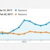
Analyzing website data involves a systematic approach to uncover areas for improvement. The process begins with defining clear goals and objectives. This sets the stage for targeted data collection and analysis. Once data is collected, it must be organized and presented in a clear and concise manner, facilitating identification of key patterns and trends. Visual representations of the data, such as charts and graphs, provide a clear picture of website performance and facilitate the identification of areas requiring improvement.
A crucial aspect of analysis is identifying patterns and anomalies in the data. By meticulously reviewing trends and anomalies, you can pinpoint areas needing optimization.
Interpreting Website Analytics Data
Interpreting website analytics data is a crucial step in conversion rate optimization. This involves a careful examination of the data, identifying trends, and recognizing patterns. This process is not simply about recognizing numbers but understanding the context and impact of the data on user behavior and website performance. For instance, a sudden drop in conversion rates may indicate a problem with the website design or functionality.
By identifying these patterns, you can quickly address the issue and optimize website performance. Understanding the context behind the numbers is paramount to actionable insights.
Examples of Key Performance Indicators (KPIs) for Websites
A well-defined set of KPIs provides a framework for tracking website performance and identifying areas needing improvement. A comprehensive list of KPIs enables a thorough evaluation of website effectiveness and user engagement. The table below illustrates key performance indicators for websites, including descriptions, tracking methods, and interpretation guidelines.
| KPI | Description | How to Track | Interpretation |
|---|---|---|---|
| Sessions | Number of visits to the website. | Google Analytics | High sessions can indicate strong interest in the site. |
| Bounce Rate | Percentage of single-page visits. | Google Analytics | High bounce rate might suggest issues with the landing page or content. |
| Conversion Rate | Percentage of visitors completing a desired action. | Google Analytics, custom tracking | Low conversion rate requires investigation for improvement. |
| Average Session Duration | Average time spent on the site per visit. | Google Analytics | Short session duration might suggest issues with content engagement. |
| Pages per Session | Average number of pages viewed per visit. | Google Analytics | Low pages per session might suggest poor content quality or navigation. |
Final Wrap-Up
In conclusion, optimizing your website for conversions is a multifaceted process requiring a comprehensive approach. By implementing the strategies Artikeld in this guide, you can enhance your website’s user experience, increase engagement, and ultimately boost conversion rates. Remember, consistency and continuous analysis are key to achieving long-term success in your online endeavors. Understanding your target audience and their needs is the foundation for any successful optimization strategy.