Three interactive dashboarding tools your company should be using to gain actionable insights and drive better business decisions. Interactive dashboards are transforming how businesses approach data analysis. They provide a dynamic, visual representation of key metrics, enabling real-time monitoring and faster responses to market fluctuations. Choosing the right dashboarding tools is crucial for maximizing their benefits. This guide explores three powerful options, examining their features, functionalities, and how they can be tailored to specific business needs.
This exploration delves into the advantages of interactive dashboards, examining how they facilitate data-driven decision-making and boost overall efficiency. We’ll analyze their capabilities, comparing them to traditional reporting methods, and ultimately helping you determine which tool aligns best with your company’s unique requirements.
Introduction to Interactive Dashboarding
Interactive dashboarding is a powerful approach to visualizing and analyzing data, transforming raw information into actionable insights. It goes beyond static reports by enabling users to explore data dynamically, drill down into details, and identify trends and patterns in real-time. This interactive nature empowers users to make more informed decisions, driving efficiency and productivity across an organization.Interactive dashboards leverage sophisticated data visualization techniques to present key performance indicators (KPIs) and other relevant metrics in a clear and engaging format.
This facilitates a quick understanding of the overall health of the business, highlighting areas needing attention and opportunities for improvement. This capability is particularly useful in rapidly changing business environments where agility and responsiveness are crucial.
Key Features and Benefits of Interactive Dashboards
Interactive dashboards provide several advantages over traditional reporting methods. They allow users to explore data in depth, identifying correlations and causations that might otherwise be missed. This feature empowers data-driven decision-making and enhances strategic planning. Furthermore, they provide a comprehensive overview of key metrics, enabling real-time monitoring of performance and enabling quick responses to emerging issues.
Examples of Interactive Dashboard Applications
Interactive dashboards can be applied across various business functions. For instance, a sales team can use a dashboard to track sales performance by region, product, and sales representative. This allows them to quickly identify top performers, areas needing improvement, and potential sales growth opportunities. In marketing, interactive dashboards can display campaign performance, customer engagement metrics, and website traffic, helping marketers optimize their strategies and campaigns for better results.
Operations teams can utilize interactive dashboards to monitor production efficiency, identify bottlenecks, and optimize resource allocation, leading to significant cost savings and improved productivity.
Comparison of Interactive Dashboards and Traditional Reporting Methods
| Feature | Interactive Dashboards | Traditional Reporting Methods |
|---|---|---|
| Data Visualization | Dynamic, interactive visualizations (charts, graphs, maps) allowing exploration and drill-down. | Static reports (tables, text-based summaries) offering limited exploration. |
| Data Exploration | Users can filter, sort, and drill down into data to uncover patterns and trends. | Limited ability to explore data beyond the pre-defined report structure. |
| Real-time Updates | Dashboards can be updated in real-time, providing instant insights into current performance. | Reports are typically generated at specific intervals (e.g., daily, weekly) and may not reflect current data. |
| User Interaction | Users can interact with the dashboard to customize views and explore different aspects of the data. | Users are largely passive recipients of information presented in the report. |
| Actionability | Dashboards facilitate data-driven decision-making, providing clear insights into areas needing improvement. | Reports may provide information, but translating it into action can be challenging. |
Importance of Choosing the Right Dashboarding Tools
Selecting the right interactive dashboarding tool is critical for maximizing its benefits. A tool that doesn’t integrate well with existing systems, lacks essential features, or doesn’t align with the company’s specific needs will ultimately limit its effectiveness. A tool tailored to the company’s data structure and reporting requirements will yield the best results. Consider factors such as scalability, customization options, ease of use, and data security when evaluating potential dashboarding tools.
Top Three Interactive Dashboarding Tools
Interactive dashboards are crucial for visualizing data and gaining actionable insights. Choosing the right tool is vital for efficiency and effectiveness. This section details three popular choices, highlighting their strengths, weaknesses, and core functionalities.
Tableau
Tableau is a widely recognized leader in the business intelligence (BI) space. Its strengths lie in its powerful data visualization capabilities and user-friendly interface, making it suitable for users of varying technical expertise. It allows for complex data manipulations and insightful visualizations. Tableau excels at connecting to diverse data sources, a key factor for companies with multiple systems and databases.
- Core Functionalities: Tableau offers a wide range of visualization options, including charts, graphs, maps, and dashboards. It supports various data connections, allowing users to pull data from different sources and integrate them into unified dashboards. It facilitates interactive exploration of data through filters, drill-downs, and highlighting. Furthermore, it includes a robust feature set for data preparation and analysis, enabling users to manipulate and transform data before visualization.
- User Experience: Tableau’s drag-and-drop interface and intuitive design make it easy to learn and use. It provides various tutorials and resources for users at all levels. The interactive nature of the dashboards allows users to quickly explore and understand their data.
- Strengths: Powerful data visualization, user-friendly interface, extensive data source connectivity, interactive exploration.
- Weaknesses: The extensive feature set can be overwhelming for new users. The licensing costs can be a significant investment for some companies.
Power BI
Microsoft Power BI is a comprehensive suite of business analytics tools, integrated into the broader Microsoft ecosystem. It’s a compelling option for organizations already heavily invested in Microsoft technologies. Its integration with other Microsoft products enhances data flow and collaboration.
- Core Functionalities: Power BI allows for creating interactive dashboards and reports from various data sources. Its built-in features enable data modeling, data transformations, and visualization. It provides a collaborative environment for data sharing and analysis. It also supports embedding dashboards into websites and other applications.
- User Experience: The user interface is straightforward, resembling other Microsoft products. Its drag-and-drop functionality and visual design elements make it relatively easy to learn. It offers tutorials and a supportive community for user assistance.
- Strengths: Strong integration with Microsoft ecosystem, comprehensive features, collaborative environment, cost-effectiveness for Microsoft users.
- Weaknesses: Limited customization options compared to some competitors, can be challenging to manage large datasets efficiently.
Qlik Sense
Qlik Sense is known for its advanced data discovery capabilities. It emphasizes the ability for users to explore data in a self-service manner.
- Core Functionalities: Qlik Sense is built around a unique “associative engine” which facilitates linking and analyzing data across different dimensions. Users can explore relationships between data points easily and create interactive visualizations that dynamically adjust to user selections.
- User Experience: Qlik Sense offers a highly interactive experience, focusing on allowing users to explore data and uncover insights on their own. The visual interface allows for drill-down, drill-through, and rapid data exploration.
- Strengths: Powerful associative engine for discovering relationships, self-service exploration capabilities, user-friendly interface for data exploration.
- Weaknesses: Learning curve for advanced features can be steep, and the user interface might be less intuitive for some users compared to Tableau or Power BI.
Comparative Overview
| Feature | Tableau | Power BI | Qlik Sense |
|---|---|---|---|
| Pricing | Variable, based on usage and features | Variable, based on user licenses and features | Variable, based on user licenses and features |
| Target Audience | Data analysts, business intelligence professionals, and general users | Microsoft users, business analysts, and data analysts | Data analysts, business intelligence professionals, and self-service data explorers |
| Features | Extensive visualization, advanced data preparation | Comprehensive data analysis and visualization, integration with Microsoft tools | Advanced associative engine, data discovery |
Tableau: Unveiling Data’s Potential
Tableau, a powerful data visualization tool, empowers businesses to transform raw data into actionable insights. Its intuitive interface and vast array of features make it a popular choice for data analysts and business intelligence professionals. This deep dive will explore the specific features that make Tableau stand out, demonstrate dynamic visualization techniques, and provide a practical guide for creating compelling dashboards.Tableau’s robust feature set allows for the creation of interactive dashboards that dynamically respond to user interactions.
Users can drill down into specific data points, filter information based on various criteria, and explore different perspectives without the need for complex programming. This responsiveness and flexibility enable a dynamic, engaging experience, empowering users to discover hidden patterns and trends in their data.
Key Features that Set Tableau Apart
Tableau excels with its drag-and-drop interface, simplifying the process of creating visualizations. Users can connect to various data sources, from spreadsheets to databases, with ease. The ability to quickly manipulate data through filters, calculations, and custom parameters allows users to tailor their dashboards to specific needs and perspectives. This streamlined approach enables faster analysis and facilitates insightful decision-making.
Dynamic Data Visualization Techniques
Tableau enables a range of interactive visualizations, from simple bar charts to complex dashboards. These visualizations can effectively communicate key metrics and insights. Interactive elements, such as tooltips and highlighting, provide context to data points and facilitate exploration. For instance, a bar chart showing sales performance across different regions can be further analyzed by hovering over specific bars to reveal the sales figures for individual products or specific time periods.
Similarly, maps can be used to visualize geographical patterns, allowing users to drill down to specific locations or zoom out to observe broader trends.
Compelling Data Visualizations with Tableau
A compelling visualization effectively conveys information and sparks interest. Tableau facilitates creating impactful visualizations by offering a diverse range of chart types, including bar charts, line charts, scatter plots, maps, and more. For example, a line chart showcasing sales trends over time can reveal seasonal patterns or identify significant growth periods. Scatter plots can highlight correlations between variables, revealing insights that might otherwise be missed.
Furthermore, interactive maps provide a clear visual representation of geographical data, allowing users to identify patterns and trends based on location.
Want to supercharge your company’s performance? Three interactive dashboarding tools are a must-have. They’ll give you real-time insights into key metrics, helping you make data-driven decisions. And, let’s be honest, understanding your marketing efforts is crucial, which is why mastering the only marketing strategy you need is so important. These tools will help you track your progress using that strategy, making it easier to achieve your goals.
In short, these interactive dashboards are essential for any modern business.
Creating a Basic Tableau Dashboard
This section Artikels the steps to create a basic dashboard in Tableau, demonstrating its ease of use. The process is highly intuitive and can be completed in a few simple steps.
| Step | Action |
|---|---|
| 1 | Connect to Data Source: Choose the data source (e.g., Excel file, CSV, Database) and establish a connection. |
| 2 | Drag and Drop Fields: Select the fields to be included in the visualization. Drag the desired fields from the data source to the appropriate positions on the canvas. |
| 3 | Select Visualization Type: Choose the appropriate visualization type (e.g., bar chart, line chart, map) based on the data and desired insights. |
| 4 | Customize Visualization: Modify the visualization by adjusting colors, labels, and other formatting elements to enhance clarity and impact. |
| 5 | Add Interactivity: Implement interactive features such as filters and tooltips to facilitate deeper data exploration. |
Power BI: Empowering Data-Driven Decisions: Three Interactive Dashboarding Tools Your Company Should Be Using
Power BI, a powerful business intelligence tool, offers a user-friendly interface and a wide array of features for visualizing and analyzing data. Its ability to connect to various data sources and transform raw data into actionable insights makes it a valuable asset for organizations seeking to leverage their data for better decision-making. It’s a robust tool for creating interactive dashboards and reports, perfect for teams needing to collaborate and share data effectively.
Key Features and Advantages
Power BI’s strength lies in its comprehensive suite of features, including its intuitive drag-and-drop interface. This allows users to easily build visualizations without extensive coding knowledge. Furthermore, its ability to connect to numerous data sources, such as Excel spreadsheets, SQL databases, and cloud services, makes it highly adaptable to different organizational structures. This versatility enables users to bring together data from various sources into a single platform, fostering a unified view of business performance.
Data Presentation and Accessibility
Power BI excels at transforming complex data into easily understandable visualizations. Its interactive charts, graphs, and maps enable users to explore data from multiple perspectives. Users can drill down into specific details, filter data by various criteria, and generate customized reports, tailoring the experience to specific user needs. This accessibility ensures that key insights are easily communicated to stakeholders across the organization, facilitating data-driven decisions.
Boosting your company’s data insights starts with the right interactive dashboards. Three fantastic tools to consider are Power BI, Tableau, and Google Data Studio. Knowing how to effectively use these tools is key to making data-driven decisions. And, let’s face it, if you’re not effectively promoting your website, you’re missing out on a crucial aspect of using these dashboards to their full potential.
Learning how to promote your website can significantly increase your website traffic and, ultimately, your dashboard’s usage. This will help your team see the value in these tools and how they’re essential for your company’s success.
Collaboration and Data Sharing
Power BI fosters seamless collaboration through its robust sharing features. Users can share dashboards and reports with colleagues, enabling team-wide access to vital information. Collaboration is further enhanced through features like co-authoring and commenting, encouraging feedback and iterative refinement of analyses. This shared understanding of data facilitates better teamwork and more informed decisions.
Data Security and Privacy
Power BI prioritizes data security and privacy with robust security measures. These measures ensure that sensitive data is protected and that access is controlled to authorized users. Data encryption and access control features protect confidential information. The tool also complies with industry-standard data security protocols, ensuring the confidentiality, integrity, and availability of data.
Customization Options
Power BI offers a wide array of customization options, allowing users to tailor the tool to their specific needs.
- Visualizations: A vast library of interactive visualizations, including charts, graphs, maps, and more, enables users to choose the best way to represent their data.
- Data Sources: Connections to various data sources—from Excel files to cloud databases—allows for seamless integration of data from different systems.
- Dashboards: Customizable dashboards enable users to aggregate key metrics and visualizations, creating personalized views of the data.
- Reports: Users can create interactive reports to provide detailed insights into specific data sets, complete with filtering and drill-down capabilities.
- Data Modeling: Advanced data modeling features enable users to create relationships between data sets and gain deeper insights from combined data.
Qlik Sense: Unleashing Self-Service Analytics
Qlik Sense stands out from other dashboarding tools by its robust self-service analytics capabilities. Users can easily explore data, create visualizations, and build dashboards without extensive training in programming or data manipulation. This empowers business users across departments to gain valuable insights and drive better decisions.
Specific Features
Qlik Sense’s unique feature set empowers users to connect and analyze data from diverse sources in a unified platform. The core strength lies in its associative engine, which allows users to establish connections between seemingly unrelated data points, leading to powerful insights. Furthermore, the tool provides interactive visualizations, allowing users to drill down into details and uncover hidden patterns.
This flexibility and ease of use set Qlik Sense apart, allowing for a broader range of users to engage in data exploration.
Reporting Capabilities
Qlik Sense excels in interactive reporting. Instead of static reports, users can create dashboards that dynamically update based on user selections. This allows for an iterative exploration of data and insights. The tool enables users to generate custom reports and visualizations based on specific criteria and filters. This feature surpasses the limitations of static reports, fostering a more dynamic and insightful approach to data analysis.
Compared to Tableau and Power BI, Qlik Sense’s associative engine empowers more sophisticated and nuanced reporting, linking seemingly disparate data points to uncover more comprehensive insights.
Integration Capabilities
Qlik Sense’s robust API and connectors enable seamless integration with a wide array of business applications. The tool can connect to various data sources, including databases, cloud services, and on-premises applications. This flexibility is crucial for companies looking to leverage their existing data infrastructure without costly and time-consuming data migration projects.
Integrating with a CRM System (Example: Salesforce)
Integrating Qlik Sense with a CRM system like Salesforce allows businesses to combine customer relationship data with other relevant information. A step-by-step process for integration typically includes:
- Connection Setup: Establish a connection between Qlik Sense and your Salesforce instance using the appropriate connector or API. Detailed instructions will be available from Qlik Sense documentation.
- Data Extraction: Extract the required data from your Salesforce CRM. This might involve defining specific fields and criteria to pull the most relevant information for analysis.
- Data Transformation (Optional): Transform or cleanse the data as needed to ensure data quality and compatibility with Qlik Sense’s structure.
- Data Modeling: Create relationships between data from Qlik Sense and Salesforce to link customer interactions with other data sources.
- Dashboard Creation: Design and build interactive dashboards to visualize customer behavior, sales trends, and other relevant metrics, leveraging data from both Qlik Sense and Salesforce.
Data Sources
Qlik Sense supports a wide array of data sources, providing flexibility for diverse data needs.
Want to supercharge your company’s performance? Three interactive dashboarding tools can help. These tools will give you real-time insights into key metrics. By leveraging these tools, you can build stronger customer relationships, fostering loyalty and driving revenue growth. For example, exploring strategies like relationship marketing use connect customers is crucial, allowing you to effectively segment and personalize interactions.
Ultimately, these dashboards will empower your team to make data-driven decisions and optimize your entire business operation.
| Data Source Type | Example |
|---|---|
| Databases | MySQL, PostgreSQL, SQL Server |
| Cloud Services | Amazon Web Services (AWS), Microsoft Azure |
| Flat Files | CSV, Excel, JSON |
| Other Applications | Salesforce, SAP, Marketing Automation Tools |
Choosing the Right Tool

Selecting the ideal interactive dashboarding tool hinges on a careful evaluation of your company’s unique needs and the strengths of each platform. A one-size-fits-all approach is rarely effective; thorough analysis is crucial to ensuring the chosen tool aligns seamlessly with your business objectives and future growth trajectory. This section delves into the key factors to consider when making your decision.
Evaluating Strengths and Weaknesses
Different tools excel in different areas. Tableau, for instance, is renowned for its robust visualization capabilities and extensive data source compatibility. Power BI, meanwhile, shines with its strong integration with Microsoft ecosystem products and user-friendly interface. Qlik Sense, however, stands out for its advanced self-service analytics features, empowering end-users with greater flexibility and control. Recognizing these nuances is essential for a precise fit.
Checklist for Evaluating Dashboarding Tools
This checklist helps align a dashboarding tool with your company’s specific requirements. Consider these points during your evaluation process.
- Data Sources: Does the tool support the data formats and sources used by your company? Consider the volume and variety of data, as well as the data’s structure.
- Visualization Capabilities: Does the tool provide the range of charts and graphs needed to effectively communicate your data insights? Consider the visual complexity and customization options required.
- User Interface (UI) and User Experience (UX): Is the tool intuitive and easy to navigate for your users, regardless of their technical proficiency? A user-friendly interface is critical for widespread adoption and effective use.
- Scalability: Can the tool handle your current data volume and anticipated future growth? Consider factors such as processing speed and storage capacity.
- Security: Does the tool offer adequate security measures to protect sensitive data? Compliance with industry standards and data protection regulations is paramount.
- Integration Capabilities: Does the tool integrate seamlessly with your existing business applications? Consider the importance of data flow and accessibility across different systems.
- Support and Training: What kind of support and training resources are available? A strong support system is essential for troubleshooting and maximizing the tool’s potential.
- Customization Options: Does the tool offer sufficient customization options to meet specific business needs? The ability to tailor dashboards to unique requirements is crucial.
Assessing Scalability and Adaptability
Evaluating scalability involves understanding the tool’s capacity to handle increasing data volumes and user demands. Consider the tool’s ability to adapt to evolving business needs and processes. For example, if your company anticipates a substantial increase in data volume, the tool should be capable of processing this data efficiently.
Comparing Pricing Models
Pricing models for these tools vary, offering different tiers based on features, users, and data volume. It’s crucial to understand the cost implications before committing to a specific tool. A comprehensive comparison is presented below.
Pricing Comparison Chart
| Feature | Tableau | Power BI | Qlik Sense |
|---|---|---|---|
| Basic | Starting at $700/user/year | Starting at $9.99/user/month | Starting at $30/user/month |
| Standard | Starting at $1,200/user/year | Starting at $20/user/month | Starting at $50/user/month |
| Premium | Variable pricing based on needs | Variable pricing based on needs | Variable pricing based on needs |
Note: Pricing is subject to change and may vary based on specific configurations and add-ons. Contact each vendor for precise pricing details.
Implementing and Utilizing Dashboards
Implementing interactive dashboards within a company’s workflow requires a strategic approach. It’s not simply about installing software; it’s about integrating data-driven insights into daily operations and decision-making. This process demands careful planning, user training, and a commitment to ongoing maintenance. A well-implemented dashboard system empowers employees to make informed choices, leading to improved efficiency and profitability.Effective dashboard implementation isn’t a one-time event; it’s an ongoing process of refinement and adaptation.
Continuous monitoring and adjustments are essential to ensure the dashboards remain relevant and useful to the users. This involves evaluating the effectiveness of the dashboards, gathering feedback from users, and making necessary modifications to optimize their value.
Implementing Dashboard Tools within a Company Workflow, Three interactive dashboarding tools your company should be using
The implementation process should be phased, beginning with a pilot program. Identify key departments and business processes where dashboards can provide significant value. This initial implementation allows for testing and refinement before full-scale rollout. Clear communication with stakeholders throughout the process is vital to ensure everyone understands the goals and expected outcomes. Detailed documentation, including user guides and training materials, should be prepared in advance.
User Training and Support for Successful Adoption
User training is crucial for successful dashboard adoption. Comprehensive training programs should cover both the technical aspects of using the dashboard tools and the business context of the data presented. This training should include practical exercises and real-world examples to demonstrate the application of the dashboards in their daily tasks. Ongoing support, through readily accessible documentation, online forums, or dedicated support teams, is also essential to ensure users can overcome any challenges they encounter.
This continuous support helps users become proficient in utilizing the dashboards for their decision-making processes.
Creating Effective Dashboards that Align with Business Objectives
Dashboards should be meticulously designed to align with specific business objectives. First, identify the key performance indicators (KPIs) that reflect the company’s goals. Next, design dashboards to visualize these KPIs in an easily understandable manner. These dashboards should display the data in a way that enables users to identify trends, patterns, and anomalies quickly. Clear labeling, intuitive navigation, and an aesthetically pleasing layout are essential to maintain user engagement and enhance data comprehension.
Best Practices for Data Visualization and Dashboard Design
Data visualization plays a pivotal role in dashboard effectiveness. Utilize a variety of charts and graphs, such as bar charts, line graphs, and pie charts, to represent data clearly. Choose the visualization type that best suits the data and the message you want to convey. Ensure data accuracy and consistency. Avoid misleading visualizations by using appropriate scales and labels.
Simplicity is key. Complex dashboards can be overwhelming and lead to misinterpretation. Prioritize clarity and focus on displaying only the essential information. Focus on user-friendliness.
Ongoing Dashboard Maintenance and Improvement Plan
Ongoing dashboard maintenance and improvement are essential to ensure dashboards remain valuable. Establish a schedule for regular updates and data refreshes. Review and update the dashboards regularly to reflect changes in business processes and data sources. Gather feedback from users on dashboard functionality and identify areas for improvement. This involves a periodic review of dashboards, with users being actively involved in suggesting improvements.
Case Studies (Illustrative Examples)
Real-world applications of interactive dashboarding tools often reveal compelling stories of improved business performance. Companies across various sectors have successfully implemented these tools, unlocking valuable insights from their data and driving significant positive changes. These examples demonstrate the tangible benefits of data visualization and analysis.
Retailer Optimizing Inventory Management
A major retailer struggled with fluctuating inventory levels, leading to both stockouts and excess inventory. Using Tableau, they built a dashboard that displayed real-time sales data, inventory levels, and supplier lead times. The dashboard highlighted trends and patterns, allowing them to proactively adjust inventory levels based on demand. This led to a significant reduction in storage costs and improved customer satisfaction by ensuring products were readily available.
By predicting future demand and adjusting inventory based on actual sales data, the retailer optimized its supply chain and reduced waste, achieving substantial cost savings and enhanced customer experience.
Manufacturing Company Enhancing Production Efficiency
A manufacturing company faced challenges in optimizing its production processes. Using Power BI, they created a dashboard that tracked key metrics like machine uptime, defect rates, and production output. The dashboard provided clear visual representations of these metrics, enabling the company to identify bottlenecks and inefficiencies. By pinpointing the root causes of delays and errors, they implemented targeted improvements in machine maintenance and training protocols.
This led to a 15% increase in production output and a 10% decrease in defects, demonstrating the power of data-driven decision-making in improving efficiency.
Financial Institution Improving Customer Service
A financial institution wanted to enhance its customer service response times. Employing Qlik Sense, they created a dashboard that tracked customer service tickets, agent performance, and resolution times. The interactive nature of the dashboard allowed analysts to drill down into specific issues and identify areas for improvement in agent training and workflow. The dashboard also enabled proactive identification of recurring issues and the development of preventative measures, ultimately leading to a 20% reduction in average resolution times and improved customer satisfaction scores.
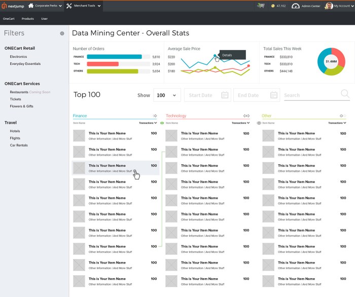
Hypothetical Dashboard Example: Sales Performance
| Metric | Q1 2024 | Q2 2024 | Difference |
|---|---|---|---|
| Total Sales | $1,500,000 | $1,750,000 | $250,000 (16.7% increase) |
| Sales by Region |  |
 |
Increased sales in Region 1 |
| Sales by Product Line |  |
 |
Increased sales in Product Line X |
Note: Replace placeholders like “region1_q1_sales.png” with actual visualizations showing sales data for each region in Q1 and Q2. Similar visualizations would exist for product lines, etc. The dashboard would also likely include interactive filters, allowing users to drill down into specific data points and explore various perspectives on sales performance.
Wrap-Up
In conclusion, adopting interactive dashboards is no longer a luxury, but a necessity for modern businesses seeking to stay competitive. This guide has presented three robust options, each with unique strengths. By understanding their functionalities, pricing models, and user experiences, you can make an informed decision about which tool best supports your company’s objectives. Remember to consider your specific needs and prioritize scalability and integration with existing systems.
Implementing the right interactive dashboard can revolutionize your approach to data analysis and drive significant improvements in your business performance.