

Mobile first website design – Mobile-first website design is the cornerstone of modern web development. It prioritizes the mobile experience, ensuring a seamless and engaging journey for users on all devices. This approach not only boosts user satisfaction but also significantly impacts search engine rankings and overall business success. By understanding the principles and practical applications of mobile-first design, you can craft websites that thrive in today’s mobile-centric world.
This comprehensive guide delves into the intricacies of mobile-first design, from foundational principles to advanced optimization techniques. We’ll explore the technical aspects, user experience considerations, content strategies, performance optimization, and essential tools and technologies to empower you in building effective mobile-first websites.
Introduction to Mobile-First Design

Mobile-first design is a website development approach that prioritizes the mobile user experience. It emphasizes creating a website that is functional and visually appealing on smaller screens, like smartphones and tablets, before scaling up to larger desktop displays. This methodology ensures a positive user experience across various devices and screen sizes.This approach is a fundamental shift from the traditional desktop-first method.
By considering the mobile experience first, developers create websites that are responsive, intuitive, and easily navigable, regardless of the device being used. This focus on the mobile user experience translates to a better overall user experience for all users, and ultimately leads to improved website performance and engagement.
Definition of Mobile-First Design
Mobile-first design is a website development strategy where the design and development process starts with the mobile version of a website. This means that the layout, functionality, and content are optimized for smaller screens before considering larger ones like desktops. This approach focuses on creating a seamless experience across all devices.
Core Principles of Mobile-First Thinking
The core principles behind mobile-first thinking are centered on usability and accessibility. These principles focus on the mobile user experience. Mobile-first design prioritizes:
- Simplified Navigation: Mobile screens have limited space, so navigation must be streamlined and intuitive. Clear, concise menus and easy-to-use controls are crucial.
- Clear Visual Hierarchy: Essential content is prominent on smaller screens, making it easy for users to find what they need quickly.
- Efficient Content Delivery: Information is presented in a digestible format, minimizing scrolling and maximizing readability.
- Performance Optimization: Websites are optimized for fast loading times to ensure a positive user experience.
Benefits of Prioritizing Mobile Experience
Prioritizing the mobile experience offers numerous benefits:
- Improved User Engagement: A seamless mobile experience encourages users to interact with the site more frequently.
- Increased Conversion Rates: A positive mobile experience can translate to more conversions, especially in e-commerce or service-based businesses.
- Enhanced Ranking: Search engines prioritize mobile-friendly websites, leading to higher search engine rankings.
- Wider Accessibility: Mobile-first design ensures that the website is accessible to a wider range of users, regardless of their device.
Comparison: Mobile-First vs. Desktop-First
The difference between mobile-first and desktop-first design lies in the starting point of the design process. Mobile-first starts with the mobile version, optimizing for smaller screens first. Desktop-first starts with the desktop version, adapting for mobile screens later.
| Feature | Mobile-First | Desktop-First | Impact |
|---|---|---|---|
| Initial Focus | Mobile devices | Desktop devices | Mobile-first prioritizes user experience on smaller screens, leading to better mobile user experience. Desktop-first prioritizes desktop user experience, potentially leading to a less optimal mobile experience. |
| Development Approach | Develop for mobile, then adapt for desktop | Develop for desktop, then adapt for mobile | Mobile-first is often more responsive and efficient for mobile, desktop-first might need significant adjustments to make the mobile experience optimal. |
| Content Prioritization | Essential content is displayed prominently on smaller screens. | Content might be overcomplicated for mobile devices, leading to a less efficient mobile experience. | Mobile-first design ensures vital information is easily accessible. |
| User Experience | A more streamlined and intuitive experience on all devices. | Potentially a less intuitive and user-friendly experience on mobile devices. | Mobile-first design leads to a consistent and positive user experience across all devices. |
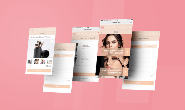
Examples of Successful Mobile-First Websites
Numerous websites successfully utilize mobile-first design principles. Examples include major social media platforms (e.g., Twitter, Instagram) and e-commerce giants (e.g., Amazon, eBay). These websites prioritize a seamless experience on all devices, demonstrating the effectiveness of this approach. Their responsive design and streamlined layouts exemplify the benefits of mobile-first design.
Technical Aspects of Mobile-First Design
Mobile-first design isn’t just about aesthetics; it’s a fundamental shift in how websites are built. This approach prioritizes the mobile experience, which has become the dominant way people access the web. This necessitates a deeper understanding of the technical underpinnings, from responsive design principles to the tools used to implement them.This section delves into the technical considerations of mobile-first development, focusing on the crucial elements that ensure a seamless and optimized user experience across various devices.
Understanding these aspects is essential for building robust and scalable websites that perform exceptionally well on all screens.
Mobile-first website design is all about prioritizing the mobile experience, which is super important these days. It’s a great way to make sure your site is accessible and user-friendly on all devices. Thinking about how users will interact with your site on their phones first can really help you find your blue ocean – a unique space in the market where you can stand out from the crowd and truly connect with your target audience.
find your blue ocean This approach, when done correctly, leads to a seamless and intuitive experience for everyone, regardless of the device they’re using, and makes your mobile-first design even more effective.
Responsive Design
Responsive design is paramount in mobile-first development. It allows websites to adapt seamlessly to different screen sizes and orientations, ensuring optimal display on desktops, tablets, and smartphones. This dynamic adjustment prevents the need for separate websites or mobile apps, simplifying maintenance and enhancing user experience. It’s a core component of any modern website, enabling content to flow gracefully across varying screen sizes.
CSS Frameworks in Responsive Layouts
CSS frameworks provide pre-built styles and components, significantly streamlining the development process. These frameworks often include responsive grid systems and pre-defined styles that can be easily customized for specific mobile-first design needs. They save considerable time and effort by providing a foundation for layouts, reducing the need for manual styling.
Viewport Units and Media Queries
Viewport units, like viewport-relative units (vw, vh, vmin, vmax), are crucial for responsive design. They allow elements to scale proportionally to the viewport, ensuring consistent sizing across different screen sizes. Media queries, on the other hand, dynamically adjust styles based on various device characteristics like screen width, orientation, and resolution. Together, these elements empower developers to create responsive designs that adapt seamlessly to various screen sizes and orientations.
Mobile-Specific UI Components
Mobile-first design necessitates the use of UI components tailored for touchscreens and smaller screens. These components often include elements optimized for tap interactions, intuitive navigation, and concise information presentation. Mobile-specific UI components contribute to a streamlined user experience on mobile devices, improving usability and reducing cognitive load.
Summary of CSS Frameworks
| Framework | Responsive Design Features | Mobile-First Support | Use Cases |
|---|---|---|---|
| Bootstrap | Responsive grid system, pre-defined components, extensive documentation | Excellent, widely used for mobile-first development | General-purpose web development, e-commerce sites, landing pages |
| Foundation | Modular components, responsive grid system, extensive documentation | Strong, particularly well-suited for creating mobile-friendly interfaces | Web apps, interactive sites, projects requiring custom UI elements |
| Material Design | Emphasis on visual consistency, mobile-first design principles, responsive components | Excellent, integrates seamlessly with Google’s design guidelines | Applications that need a visually consistent interface and strong brand identity |
| Tailwind CSS | Utility-first approach, easy customization, rapid prototyping | Excellent, flexible for different mobile-first implementations | Projects needing fast development cycles and customization options |
User Experience (UX) Considerations
Mobile-first design isn’t just about fitting a website onto a smaller screen; it’s about fundamentally rethinking the user experience. This shift in perspective profoundly impacts how users interact with your content, ultimately influencing engagement and conversion rates. By prioritizing the mobile experience, businesses can create a more intuitive and satisfying journey for their users, regardless of the device they are using.Mobile-first design prioritizes a user-centered approach, ensuring that the core functionalities and information are readily accessible on smaller screens.
This strategy compels designers to streamline content and interactions, resulting in a more focused and efficient experience for the end-user.
Intuitive Navigation on Smaller Screens
Effective navigation is crucial for a positive user experience. On smaller screens, the challenge lies in condensing complex navigation structures into easily accessible and intuitive formats. Minimizing clutter and utilizing clear visual cues are paramount. Implementing hamburger menus, collapsible sections, or touch-friendly icons ensures easy access to all essential sections without overwhelming the user. The use of clear visual hierarchy, like contrasting colors and different font sizes, guides users through the navigation effortlessly.
Utilizing progressive disclosure—showing only relevant options as needed—further streamlines the experience. This approach minimizes cognitive load, enabling users to accomplish their tasks with minimal effort.
Simplified Content and Clear Calls-to-Action
Mobile users often have limited attention spans. Therefore, presenting information concisely and directly is vital. Avoid long paragraphs and lengthy descriptions. Break up text with headings, subheadings, and bullet points. Use concise language, avoiding jargon and overly complex sentence structures.
Clear calls-to-action (CTAs) are equally important. Ensure they are prominently displayed, use contrasting colors, and are large enough to be easily tapped. A well-designed CTA can significantly increase conversion rates by guiding users towards the desired action.
Accessibility in Mobile-First Design
Accessibility is paramount in mobile-first design, ensuring that the website is usable by people with disabilities. This includes providing alternative text for images, ensuring sufficient color contrast for readability, and implementing keyboard navigation. Adhering to accessibility guidelines ensures that the website is usable by everyone, regardless of their abilities. This broadens the potential user base and strengthens the overall user experience.
Mobile-Optimized UI Patterns
Employing appropriate UI patterns is critical for creating a seamless mobile experience. Familiar patterns, like swipe gestures for navigation, or the use of interactive elements, enhance user familiarity and intuition. These patterns build upon user expectations and provide a more natural interaction. By adhering to established best practices, you can create a more efficient and intuitive interface for mobile users.
UI Element Adaptations for Mobile
| UI Element | Desktop Version | Mobile Adaptation | Explanation |
|---|---|---|---|
| Navigation Bar | A horizontal bar with numerous links | A hamburger menu or collapsible navigation | Reduces visual clutter and optimizes screen space. |
| Large Images | Full-width, high-resolution images | Responsive images that scale appropriately | Preserves visual appeal while ensuring optimal loading times and preventing visual distortion. |
| Forms | Long forms with multiple fields | Shorter forms, with critical fields prioritized and optional fields hidden | Improves user engagement and reduces friction during form submission. |
| Text Areas | Large text areas | Smaller text areas, or input fields for concise input | Maintains readability and functionality while preserving screen space. |
Content Strategy for Mobile
Mobile-first design prioritizes the mobile experience, ensuring your website is intuitive and accessible on smaller screens. This necessitates a tailored content strategy that optimizes readability, engagement, and user interaction on mobile devices. A well-structured mobile content strategy leads to improved user experience, higher conversion rates, and ultimately, a more successful website.Mobile content requires a different approach than desktop content.
The smaller screen real estate demands careful consideration of how information is presented. The goal is to deliver a seamless experience, not a cramped, frustrating one. Prioritizing concise and scannable text, optimized images, and a clear hierarchy of information are key elements of a successful mobile-first content strategy.
Tailoring Content for Mobile Viewing
Mobile users often have limited time and attention spans. Content needs to be easily digestible and immediately relevant. This means strategically placing important information above the fold and breaking down large blocks of text into smaller, more manageable chunks. Use clear headings, subheadings, and bullet points to guide users through the content. Avoid lengthy paragraphs and ensure all text is easy to read on a small screen.
Using high-contrast text and appropriate font sizes is crucial.
Concise and Scannable Text
Conciseness is paramount on mobile. Users are less likely to read lengthy paragraphs on a small screen. Break down content into short, impactful sentences and paragraphs. Use headings, subheadings, bullet points, and numbered lists to create a visually appealing and easily scannable layout. Employ clear and concise language, avoiding jargon or overly complex sentence structures.
Use strong s to highlight important information and encourage quick comprehension. For example, instead of a long paragraph explaining a service, use bullet points to list key benefits.
Optimizing Images for Mobile Devices
Images play a vital role in enhancing user engagement and conveying information. However, large image files can slow down loading times on mobile devices. Optimizing image sizes and formats is critical for a positive user experience. Use compressed image formats like WebP or JPEG. Resize images specifically for mobile screens, ensuring they are not overly large or small.
Use appropriate alt text to provide context and improve accessibility. Employ lazy loading to ensure images load only when they are visible in the viewport, preventing initial loading delays. Consider using vector graphics for logos and icons as they maintain quality at various sizes.
Effective Mobile-First Content Strategies
Effective mobile-first content strategies focus on the user’s needs and behaviors. Examples include using mobile-specific calls to action, incorporating interactive elements like quizzes or polls, and designing content with a focus on quick engagement. A news website might use a carousel of the day’s top stories, while an e-commerce site might display high-quality product images with concise product descriptions.
An important consideration is to test different content formats and layouts to determine what resonates best with your target audience.
Comparison of Content Formats and Optimization Techniques
| Content Format | Optimization Technique | Mobile-Friendly Example | Explanation |
|---|---|---|---|
| Text | Short, scannable paragraphs; clear headings; bullet points; concise language | “Order now and get free shipping!” | Clear, concise language with a strong call to action. |
| Images | Compressed formats (WebP, JPEG); optimized sizes; lazy loading; alt text | High-quality product image with a concise description below | High-quality images that load quickly, with alt text for accessibility. |
| Videos | Optimized video formats (MP4); adaptive playback; short video clips; clear captions | Short, engaging video demonstration of a product feature | Videos that load quickly and adapt to various screen sizes, with captions for accessibility. |
Performance Optimization for Mobile
A fast website is crucial for a positive mobile user experience. Slow loading times lead to high bounce rates, lost conversions, and a negative perception of your brand. Optimizing mobile performance is not just about aesthetics; it’s about driving engagement and achieving business goals.Mobile users have little patience for slow websites. Studies consistently show that a one-second delay in page load time can result in a significant drop in conversions.
This underscores the critical importance of optimizing every aspect of your mobile website for speed.
Image Optimization Techniques, Mobile first website design
Images are often a significant contributor to page load times. Proper optimization is key to delivering a swift and responsive experience.Optimizing images for web use involves a multi-faceted approach. Compressing images without sacrificing quality is crucial. Tools like TinyPNG and Compressor.io can effectively reduce file sizes. Choosing the right image format (WebP for example) is another important aspect.
A mobile-first website design is crucial these days, ensuring your site looks amazing on all devices. But great design isn’t enough for business growth; you need a strategic approach. This often involves services like strategic advertising services for business growth to reach the right audience and drive conversions. Ultimately, a mobile-first website, paired with the right advertising strategy, can significantly boost your bottom line.
WebP supports lossy and lossless compression, making it a suitable alternative to JPEG and PNG. Using responsive image techniques, which dynamically adjust image sizes based on the user’s device screen size, further improves performance. This approach ensures optimal display without compromising quality.
Caching Strategies
Caching mechanisms store frequently accessed website content on intermediary servers. This dramatically reduces the time it takes for users to access this content.Implementing caching strategies can drastically reduce server load and improve page load times. A well-configured caching system allows for the quick retrieval of static assets, such as images, CSS, and JavaScript files. This process significantly improves the website’s performance, leading to a faster and more responsive user experience.
Server-side caching stores content on the server itself, while client-side caching stores content on the user’s device.
Measuring Website Performance
Precise measurement of mobile website performance is crucial for identifying areas for improvement. Tools like Google PageSpeed Insights and Lighthouse provide detailed reports on website performance.Tools like Google PageSpeed Insights and Lighthouse provide comprehensive performance reports. These reports offer valuable insights into the various aspects of website performance. They offer metrics on factors such as loading times, resource usage, and optimization suggestions, enabling targeted improvements.
By leveraging these tools, developers can gain valuable data to identify bottlenecks and enhance the mobile experience. These tools measure factors such as First Contentful Paint (FCP), Largest Contentful Paint (LCP), Cumulative Layout Shift (CLS), and Time to Interactive (TTI).
Minimizing HTTP Requests
The number of HTTP requests a website makes directly impacts its loading time. Reducing these requests is crucial for a faster mobile experience.Reducing the number of HTTP requests is a fundamental optimization technique. Combining CSS and JavaScript files, and utilizing CSS sprites can reduce the number of requests, thus speeding up page load times. CSS sprites consolidate multiple images into a single image file, which can decrease the number of HTTP requests.

This strategy, coupled with proper compression techniques, dramatically enhances performance.
Utilizing a Content Delivery Network (CDN)
A CDN distributes website content across a network of servers globally. This approach improves loading times for users worldwide.A CDN (Content Delivery Network) strategically places cached content on servers worldwide. This reduces the distance data needs to travel, resulting in faster loading times for users across different geographic locations. For instance, a user in California will access content from a CDN server closer to them, compared to a server in Europe.
This global distribution of content significantly improves loading times and enhances the user experience for users around the world.
Mobile-First Design Tools and Technologies
Mobile-first design relies heavily on the right tools and technologies to ensure a seamless user experience across diverse devices and screen sizes. This involves careful consideration of front-end frameworks, libraries, and testing methodologies tailored for mobile platforms. Choosing the appropriate tools streamlines the development process and enhances the overall performance of the mobile website.Effective mobile-first development requires a comprehensive understanding of various tools and technologies.
These tools facilitate the creation of responsive designs, optimize performance, and ensure a consistent user experience across different mobile devices.
Front-End Frameworks for Mobile Development
Front-end frameworks provide structured codebases and pre-built components that accelerate development and improve code maintainability. These frameworks offer robust solutions for handling complex layouts, animations, and interactions specific to mobile devices. Choosing a suitable framework depends on the project’s specific needs and the team’s expertise.
- React Native: A popular choice for building native-like mobile applications using JavaScript. It allows developers to reuse code across platforms, significantly reducing development time and effort. React Native’s component-based architecture facilitates modularity and code organization, promoting maintainability and scalability.
- Ionic Framework: A powerful framework built on top of Web Components and Angular. It provides a set of pre-built components and tools for building hybrid mobile applications. Ionic applications often run in a webview within the mobile device’s browser, allowing for seamless access to the web and device capabilities. Its ease of use makes it an excellent choice for projects requiring quick development and a visually appealing mobile interface.
- Flutter: Developed by Google, Flutter uses a unique framework based on the Dart programming language. It offers excellent performance and native-like UI capabilities. Flutter is becoming increasingly popular due to its ability to create highly performant mobile applications that feel truly native on both iOS and Android devices. It has a strong community support and rapidly evolving ecosystem.
Front-End Libraries for Mobile Development
Front-end libraries offer specific functionalities that enhance mobile development. These libraries often specialize in particular areas like animations, interactions, or data handling, providing tailored solutions for specific needs. Careful selection of libraries complements the chosen framework, enhancing functionality and improving the user experience.
- React Hooks: A set of functionalities within React that allow for more functional and reusable components. They’re particularly helpful in managing state and side effects within React applications, simplifying the development process and improving code organization. React Hooks enhance the efficiency of component development and streamline complex interactions.
- Material Design Components: A collection of reusable components based on Google’s Material Design language. These components are designed to create a consistent and user-friendly mobile experience, adhering to established design principles and best practices.
Mobile Device Testing Tools
Testing mobile applications on various devices and operating systems is crucial to ensure compatibility and a consistent user experience. A range of testing tools is available, offering various functionalities and approaches to mobile testing. Tools like Appium, Espresso, and XCUITest allow for automated testing, significantly reducing testing time and ensuring thorough quality control.
Mobile-first website design is crucial these days, prioritizing a fantastic user experience on smaller screens. However, large image files can significantly slow down your site, impacting your SEO. To address this, consider using a plugin like the add wp size limit plugin to optimize image sizes within your WordPress site. This helps keep your site responsive and user-friendly, aligning perfectly with the mobile-first design principles.
- Appium: An open-source framework for automating mobile applications on various platforms. It supports a wide array of mobile platforms and devices, enabling thorough cross-platform testing. Appium’s flexibility allows developers to test different scenarios and interactions within the application.
- Espresso: Google’s testing framework for Android applications. It provides a robust set of tools for automated UI testing, including interacting with UI elements and verifying their behavior. Espresso simplifies testing and ensures a seamless user experience on Android devices.
- XCUITest: Apple’s testing framework for iOS applications. It facilitates the automation of UI tests, allowing developers to verify the functionality and behavior of the application on iOS devices. XCUITest is designed to test the behavior of iOS apps on various devices and screen sizes.
Comparison of Front-End Frameworks for Mobile
The following table summarizes the capabilities of popular front-end frameworks in mobile-first development.
| Framework | Key Features | Mobile-First Support | Example Use Case |
|---|---|---|---|
| React Native | JavaScript, Native UI, Hot Reloading | Excellent | Building cross-platform mobile applications |
| Ionic Framework | Web Components, Angular | Good | Developing hybrid mobile apps with web technologies |
| Flutter | Dart, Native UI, Hot Reload | Excellent | Creating high-performance mobile apps |
Mobile-First Design Case Studies
Mobile-first design isn’t just a trend; it’s a crucial strategy for reaching and engaging modern users. By prioritizing the mobile experience, businesses can improve user engagement, boost conversions, and ultimately, drive growth. This section explores successful mobile-first website designs across various industries, highlighting the key strategies, challenges, and outcomes.Understanding how successful mobile-first websites tackle specific challenges and achieve positive results is vital for any aspiring web designer or business owner.
These case studies offer invaluable insights into the practical application of mobile-first principles and demonstrate the tangible benefits they can bring.
Successful Mobile-First Websites
Many businesses have successfully leveraged mobile-first design to enhance user experience and achieve significant results. This approach isn’t just about creating a smaller version of a desktop website; it’s about tailoring the entire design process to prioritize mobile users from the outset.
Implementation of Mobile-First Principles
Successful mobile-first implementations demonstrate a clear understanding of user needs and expectations. These websites prioritize essential information and navigation on smaller screens, utilizing responsive design principles. Images and videos are optimized for fast loading times on various devices, and the entire design is meticulously crafted to ensure smooth navigation and intuitive interactions on touchscreens.
Challenges and Solutions
While mobile-first design offers numerous benefits, it presents unique challenges. One common challenge is balancing the needs of different devices and screen sizes. Solutions often involve employing responsive design frameworks and tools, which allow websites to dynamically adapt to various screen resolutions. Another challenge is optimizing content for smaller screens. Solutions include concise and impactful copy, clear calls to action, and well-placed interactive elements.
Impact on User Engagement and Conversions
A significant impact of mobile-first design is a noticeable improvement in user engagement. By prioritizing mobile experience, businesses can enhance user satisfaction and encourage repeat visits. Furthermore, optimizing the mobile experience often translates directly into higher conversion rates. Users are more likely to complete desired actions (e.g., making a purchase, signing up for a newsletter) on a site that is optimized for their device and their needs.
Summary of Case Studies
| Case Study | Industry | Key Improvements | Lessons Learned |
|---|---|---|---|
| Airbnb | Hospitality | Streamlined booking process, optimized for mobile searches, improved image display for quick visual assessment of properties. | Prioritizing user-friendly booking and search functionality, prioritizing visual elements for quick assessment on smaller screens are crucial. |
| Amazon | E-commerce | Responsive design, simplified product pages, enhanced search functionality, improved payment options on mobile devices. | Mobile-first approach allows for personalized experiences, improved product discovery, and optimized payment options. |
| Starbucks | Retail | Mobile order and pay functionality, optimized store locator, loyalty program integration, easy-to-use mobile app. | A mobile-first approach allows businesses to provide value-added services, enhance customer loyalty, and create seamless ordering and payment experiences. |
Last Recap: Mobile First Website Design
In conclusion, mobile-first design is not just a trend; it’s a necessity. By prioritizing the mobile experience, you cultivate a positive user journey, enhance website performance, and ultimately, drive business growth. This guide provides a robust framework for understanding and implementing mobile-first strategies, equipping you with the knowledge and tools to build websites that excel on all devices. So, let’s dive in and transform your web presence into a mobile-first masterpiece!

