
How to show before and after photo in WordPress? This guide will walk you through creating compelling before-and-after displays on your WordPress site. Whether you’re showcasing product transformations, home renovations, or personal achievements, visually demonstrating the change is crucial. From choosing the right image hosting to optimizing for speed and styling the presentation, we’ll cover everything you need to make your before-and-after comparisons stand out.
Imagine the impact of a clear, concise display of your clients’ amazing weight loss journey or a home renovation project’s transformation. Visual storytelling is powerful, and with the right techniques, your WordPress site can easily achieve this.
Introduction to Displaying Before-and-After Photos in WordPress
Before-and-after photos are a powerful tool for showcasing transformations in a WordPress website. They effectively communicate change, impact, and results, making them invaluable for various content types. Whether highlighting product improvements, showcasing personal transformations, or building credibility through testimonials, visually demonstrating a “before” and “after” state enhances engagement and persuasiveness.Using before-and-after images effectively allows readers to quickly grasp the core message and understand the positive impact of a product, service, or experience.
This visual approach is particularly engaging for users who prefer visual cues over lengthy explanations. This method is effective in a wide range of applications, and is essential for websites aiming to deliver impactful narratives.
Benefits of Using Before-and-After Photos
Before-and-after photos offer a clear and concise way to demonstrate progress, improvement, or the efficacy of a product or service. This is particularly important for building trust and credibility with potential customers. Visual proof can be more persuasive than just words alone.
Scenarios for Effective Use
Before-and-after photos can be employed in various contexts across a WordPress website. They can be integrated into product reviews, showcasing the transformation a product can deliver. Transformations, such as weight loss or home renovation, are perfectly suited for before-and-after imagery. Testimonials can be made more impactful by adding before-and-after photos to highlight the experiences of satisfied customers.
For instance, a clothing store can display photos of a customer in ill-fitting clothes before purchasing and then in well-fitting clothes after the purchase.
Optimizing Before-and-After Photos for WordPress
Properly displaying before-and-after photos in WordPress requires attention to detail. High-quality images are crucial, as blurry or low-resolution photos will detract from the message. Images should be optimized for web use, maintaining quality while reducing file size. Using appropriate alt text for images is essential for accessibility and . The images should be well-placed and aligned, ensuring they complement the surrounding text.
Examples of Effective Implementation
One example of effective use is a personal development blog. The blog could post before-and-after photos of clients who have achieved significant progress in their personal journeys. This will create a strong emotional connection with readers and showcase the positive outcomes of the blog’s services. Another example could be a fitness website, displaying before-and-after photos of clients who have lost weight and improved their fitness levels.
These types of before-and-after photos are effective in showcasing the transformative effects of the website’s services. In essence, the use of before-and-after photos adds a tangible and relatable aspect to the website’s message.
Choosing the Right Image Hosting Method: How To Show Before And After Photo In WordPress
Picking the right image hosting solution for your WordPress site is crucial for both the aesthetic appeal and performance of your before-and-after photo displays. The method you choose will impact how easily users can access your images, how quickly they load, and how your site functions overall. Choosing wisely will ensure a seamless and enjoyable user experience.Different image hosting options offer varying levels of control, storage capacity, and integration with your WordPress platform.
Understanding the strengths and weaknesses of each method is key to making an informed decision. The best approach depends on your specific needs and technical comfort level.
Image Hosting Options for WordPress, How to show before and after photo in wordpress
Various options exist for hosting images in a WordPress site, each with its own set of advantages and disadvantages. Understanding these nuances allows you to choose the solution that best fits your requirements.
- Built-in Media Library: WordPress’s built-in media library provides a straightforward way to manage images directly within your site. It’s an easy-to-use solution for basic image storage and organization. It’s ideal for smaller websites or users comfortable with the platform’s interface.
- External Image Hosting Services: External services like Imgur, Dropbox, or specialized image hosting platforms offer greater storage capacity and advanced features like image optimization. They are a strong option for larger websites with substantial image collections or those seeking enhanced performance and scalability.
Comparing Image Hosting Options
A comparison table illustrates the key differences between these options:
| Features | Built-in Media Library | External Services (e.g., Imgur, Dropbox) | Suitability |
|---|---|---|---|
| Storage Capacity | Limited by your WordPress plan. | Potentially unlimited depending on the service. | Consider site size and image volume. |
| Accessibility | Directly accessible through the WordPress site. | Accessible through URLs or APIs, potentially requiring additional steps. | Ease of access matters, especially for integrations. |
| Performance | Can be affected by site traffic and server resources. | Often optimized for speed and can improve loading times. | Prioritize speed for user experience. |
| Image Optimization | Basic optimization tools may be included. | Advanced optimization tools and resizing options may be available. | Consider needs for image quality and performance. |
| Security | Security is tied to your WordPress site’s security. | External services often have their own security protocols. | Balance platform security with service security. |
| Cost | Usually included with a WordPress plan. | May involve subscription fees or usage-based costs. | Budget and image needs should be considered. |
Choosing the right method hinges on factors like the size of your website, the volume of images, and your technical expertise. If your needs are simple and you’re comfortable with the WordPress interface, the built-in media library is often a good starting point. However, for large-scale projects or demanding performance requirements, external services provide more robust solutions.
Implementing Image Galleries in WordPress
Adding visual appeal to your WordPress site is crucial for engaging visitors and showcasing your work effectively. Image galleries are a powerful tool for presenting collections of images, and are especially useful for displaying before-and-after transformations. This section will explore various methods for creating image galleries in WordPress, highlighting their pros and cons, and demonstrating how to structure a compelling before-and-after gallery.WordPress offers several ways to display images in a visually appealing and user-friendly manner.
Understanding the different approaches allows you to select the best method for your specific needs and the design of your website. This section will delve into the details of these methods, ensuring you can create impressive photo galleries, particularly for showcasing impactful before-and-after transformations.
Built-in Gallery Feature
WordPress’s built-in gallery feature is a straightforward way to display images. It’s a simple, integrated solution for showcasing a collection of images. This method leverages WordPress’s native capabilities, which often means a streamlined user experience and a reduced learning curve.This method is highly accessible, making it suitable for beginners and users seeking a quick solution for displaying images.
However, customization options are limited compared to using plugins, which might restrict creative control. The appearance of the gallery is generally determined by the theme’s design, which could potentially clash with the overall aesthetics of the website. You’ll need to ensure the images are appropriately sized and formatted within the WordPress settings for optimal display.
Plugin-Based Galleries
Numerous plugins extend WordPress’s gallery capabilities, offering more flexibility and design options. These plugins provide a wider array of functionalities and customization features beyond the core WordPress gallery. Using plugins is advantageous when a greater degree of control over the gallery’s appearance and behavior is required.For instance, some plugins allow for intricate image sorting, different layout options, and more sophisticated gallery interactions.
This makes plugins ideal for users who want to personalize the look and feel of their galleries. They offer diverse choices in terms of layout, animations, and other visual elements. However, the use of plugins adds another layer of complexity to the website setup, and plugins can sometimes cause conflicts with other elements on the website. Ensuring compatibility and proper installation is crucial.
Organizing a Before-and-After Gallery
To effectively showcase before-and-after transformations, consider a specific arrangement of images. A grid layout is often a good choice, as it allows for easy comparison. Alternatively, a side-by-side comparison within a row or column can be used. Carefully consider the image aspect ratios and the arrangement to achieve a balanced and aesthetically pleasing gallery.Using captions beneath each image pair can further enhance the viewer’s understanding of the transformation.
Include descriptive captions that detail the changes or highlight the improvements. Consider using consistent styling for the captions to maintain a cohesive look and feel throughout the gallery. This consistency will improve the user experience and visual appeal.
Optimizing Images for Display
High-quality images are crucial for showcasing before-and-after transformations effectively. Poorly optimized images can lead to slow loading times, impacting user experience and potentially hindering conversions. Ensuring your images are optimized for both size and format is vital for a positive user experience.Effective image optimization is a multifaceted process. It involves understanding the interplay of image size, file format, and compression, and applying appropriate techniques to achieve optimal balance between image quality and file size.
The right approach will not only enhance the visual appeal of your gallery but also improve the website’s performance.
Image Size Optimization
Image size directly affects loading speed. Larger images take longer to download, leading to slower page load times and potentially a negative user experience. Optimizing image size involves reducing the dimensions of the image without significantly compromising its visual quality.
Want to showcase those impressive before-and-after transformations in your WordPress site? A key element in any professional service firm is visual storytelling. Consider this: a great way to display these photos is by using plugins. You can use these to easily position your photos for maximum impact. This is a great strategy for growth, as seen in the detailed guide on how to effectively grow your professional services firm: follow the xanax a strategy to grow your professional services firm in toug.
Ultimately, clear, compelling before-and-after images will boost your credibility and client engagement, whether you’re a contractor, consultant, or any other service provider.
- Understanding image dimensions: Different devices and screen resolutions require varying image sizes. Large images might appear blurry on smaller screens. Consider the average screen size of your target audience and optimize accordingly.
- Using image editing software: Image editing software provides tools to resize images proportionally. Tools like Photoshop, GIMP, or even online editors allow for precise control over width and height while maintaining aspect ratio.
- Cropping for specific needs: If the image contains unnecessary elements, cropping can significantly reduce file size without sacrificing the essential parts of the image. This is crucial for before-and-after comparisons, as you want to focus on the transformation itself.
File Format Selection
Choosing the correct image format is critical for balancing image quality and file size. Different formats cater to different needs.
- JPEG (Joint Photographic Experts Group): JPEG is a popular format suitable for photographs and images with numerous colors. Its compression allows for smaller file sizes but can result in some loss of quality, especially with excessive compression. It is suitable for most before-and-after photos, provided you maintain appropriate compression settings.
- PNG (Portable Network Graphics): PNG is a lossless format, preserving image quality even with compression. It is better suited for graphics, logos, or images with sharp lines or text. It’s a suitable choice for images with detailed elements that might be lost with JPEG compression, such as diagrams or charts.
- WebP: WebP is a modern format that combines the best aspects of JPEG and PNG, offering lossy and lossless compression options. It’s a great choice for balancing image quality and file size, often leading to smaller file sizes than JPEG or PNG with comparable visual quality.
Image Compression Techniques
Compression reduces the file size of an image without significant loss of quality. This directly impacts loading time.
- Using appropriate software settings: Image editing software offers various compression settings. Adjusting these settings allows you to fine-tune the balance between file size and image quality. Experiment with different compression levels to find the optimal balance.
- Online compression tools: Numerous online tools offer efficient image compression without the need for complex software. These tools often provide options for different file formats and compression levels.
- Optimizing image format for compression: Choose the appropriate format (JPEG, PNG, WebP) to ensure optimal compression. For instance, a photo may benefit from JPEG’s lossy compression, while a graphic may need the lossless quality of PNG.
Step-by-Step Guide to Optimizing Images for WordPress Galleries
Following these steps ensures your before-and-after images load quickly and display clearly in your WordPress gallery.
- Choose the right format: Select the format (JPEG, PNG, WebP) based on the image’s content. Photographs usually benefit from JPEG, while graphics might be better served by PNG or WebP.
- Resize images: Resize images to appropriate dimensions using image editing software. Consider the target audience’s screen resolutions and device types.
- Compress images: Use appropriate compression settings in your image editing software or online tools to reduce file size without compromising quality. Aim for a balance.
- Use WordPress plugins (if needed): Some WordPress plugins can optimize images automatically. Check if a plugin meets your needs.
- Review image sizes and formats: Regularly review your images to ensure they are optimized for current best practices and trends.
Styling Before-and-After Image Pairs
Once you’ve got your before-and-after photos uploaded and displayed in your WordPress site, the next step is to style them effectively. A visually appealing presentation can significantly enhance the impact of your transformations. This section will cover various methods to make your image pairs not just functional but also aesthetically pleasing, guiding you through options ranging from simple to sophisticated designs.
Different Presentation Styles
Presenting before-and-after images effectively hinges on choosing the right layout. Different layouts cater to different needs and styles. Side-by-side comparisons are a classic approach, while stacked or thumbnail views can offer unique advantages. Understanding these options allows you to select the most suitable layout for your specific content and target audience.
- Side-by-Side: This layout is a straightforward approach, placing the before and after images next to each other. It’s effective for showcasing a clear visual comparison, making it easy for the viewer to immediately grasp the changes. This layout is particularly useful when the transformations are substantial and the images are of similar sizes.
- Stacked: In a stacked layout, the before and after images are displayed one above the other. This arrangement works well for smaller images, and when the focus is on a sequential transformation. It’s ideal when you want to highlight the steps of a process or when the transformation itself is a key element of the presentation.
- Thumbnail View: This layout displays smaller versions of the before and after images, which are often linked to larger versions. It’s useful for showcasing numerous before-and-after comparisons in a compact manner, creating a gallery-like effect. It’s ideal for presenting a collection of projects or showcasing various transformation examples.
CSS Customization
WordPress themes often provide built-in styles for image galleries, allowing for basic adjustments to layouts and visual elements. However, for more intricate styling, you can use CSS to tailor the display of your before-and-after image pairs. By targeting specific elements within your WordPress theme’s structure, you can modify colors, spacing, borders, and other visual attributes to create a unique aesthetic.
Layout Comparison Table
| Layout Style | Appearance | Usability | Design Considerations |
|---|---|---|---|
| Side-by-Side | Clear comparison, easy to visually grasp. | Excellent for quick comparisons, but may not be ideal for large numbers of images. | Requires careful image sizing to maintain visual balance. |
| Stacked | Highlights sequential changes, effective for smaller images. | Good for showing step-by-step transformations, but may be less clear for large changes. | Consider visual flow and ensure sufficient spacing to prevent visual clutter. |
| Thumbnail View | Compact presentation, ideal for numerous comparisons. | Excellent for image galleries, allows users to explore multiple transformations. | Need clear links to larger versions for detailed viewing, ensure thumbnails are visually appealing. |
Using Plugins for Enhanced Functionality
Plugins can significantly streamline the process of displaying before-and-after photos in WordPress, offering features that go beyond basic image galleries. They often provide intuitive interfaces for managing image pairings, customizable layouts, and advanced options for user engagement. This often includes features for optimizing image sizes, enhancing the visual appeal of the image pairs, and enabling user interactions like liking or commenting.Beyond basic presentation, plugins can handle complex display scenarios like automatically generating thumbnails, integrating with other website features, and providing robust image management tools.
Want to showcase those impressive before-and-after photos in your WordPress blog? It’s surprisingly easy! Using plugins and a bit of formatting, you can quickly create visually appealing comparisons. Thinking about how to best present this content, it’s important to consider future content distribution leveraging multi channel strategies like this. Ultimately, the key to effective before-and-after posts is a clear, concise visual narrative, which will resonate with your audience and drive engagement.
This can save a substantial amount of time and effort in comparison to manually implementing these functionalities.
Popular WordPress Plugins for Before-and-After Photos
Several plugins cater specifically to showcasing before-and-after transformations. They often offer streamlined ways to organize and display the images in an aesthetically pleasing manner, allowing users to quickly grasp the changes and appreciate the results.
- Envira Gallery: This plugin is a powerful and versatile image gallery solution that can effectively display before-and-after image pairs. It offers extensive customization options for layout, design, and image display. Users can create stunning presentations of their transformations using Envira Gallery, including various layouts, responsive design, and integration with other WordPress features.
- NextGEN Gallery: A robust image gallery plugin, NextGEN Gallery, allows for the creation of highly customizable image galleries, including before-and-after displays. The plugin supports various image formats, offers multiple layout options, and provides advanced settings for image presentation. It can handle a large number of images and present them efficiently, often with user-friendly controls.
- WP Portfolio Manager: This plugin is designed for showcasing portfolios, and it can be adapted for presenting before-and-after photo projects. It provides excellent organization tools for image collections and enables various display styles. This plugin is suitable for individuals or businesses looking to present their work effectively, including project transformations.
- ImageOptim: While not solely a gallery plugin, ImageOptim is crucial for image optimization. It significantly reduces image file sizes without compromising quality. Smaller file sizes improve website loading speed, a critical factor for user experience, especially for sites with numerous high-resolution images like those showcasing before-and-after transformations.
Plugin Features for Enhanced Presentation
Plugins offer several features that enhance the visual presentation of before-and-after image pairs, increasing user engagement and appreciation for the transformations.
- Customizable Layouts: Plugins provide various layout options to arrange before-and-after images effectively. These options often include different styles for presenting the image comparisons. Users can choose a layout that complements their site’s aesthetic and enhances the visual appeal of the transformations.
- Responsive Design: Modern plugins are designed with responsiveness in mind, ensuring that the before-and-after displays adapt seamlessly to various screen sizes. This ensures a consistent and positive user experience across desktops, tablets, and mobile devices.
- Image Optimization: Plugins can incorporate tools for optimizing image sizes and formats. This is essential for quick loading times and improved performance, especially on mobile devices.
Responsive Design Considerations

Before-and-after photo displays need to be easily viewable on all devices. A website designed for desktop screens alone will likely be frustrating and unusable on smaller screens, such as those found on tablets and mobile phones. Responsive design is crucial for ensuring a positive user experience across the spectrum of devices.Responsive design adapts the layout and content of your website to fit the screen size of the device being used.
This includes adjusting image sizes, text font sizes, and overall layout structure to maintain readability and usability on everything from a large desktop monitor to a tiny smartphone screen. This is vital for a high-quality user experience.
Importance of Responsive Design for Before-and-After Images
Ensuring optimal display of before-and-after images across different devices is critical. A non-responsive design can lead to distorted images, poor readability, and a frustrating user experience. Images might be too large to fit on smaller screens, or text might be cut off, making the comparison difficult or impossible. This directly affects user engagement and the overall effectiveness of showcasing the transformation.
Methods for Optimal Image Display on Various Screen Sizes
Several methods can ensure optimal image display across various screen sizes. Using responsive image formats like WebP or AVIF, which are smaller and often display better quality, is essential. These formats offer a better balance of file size and image quality, especially important for high-resolution before-and-after images.Image optimization techniques, such as compressing images without significant loss of quality, are key.
Tools and plugins for image optimization can significantly reduce file sizes without compromising visual quality. This allows the images to load faster on various devices, a key component of a positive user experience. Additionally, implementing CSS media queries to dynamically adjust image sizes based on screen width is essential. This approach tailors the image size to the screen size, maintaining clarity and preventing distortion.
Testing Responsiveness of the Layout
Thorough testing is essential to ensure the layout is responsive across various devices. Using browser developer tools to simulate different screen sizes is a valuable method. These tools allow you to inspect how the images and text respond to varying screen widths, ensuring that the layout adapts correctly. Tools like responsive design checkers and mobile emulators can help simulate various devices, ensuring the layout is as expected.
Viewing the website on a variety of devices, from desktop computers to tablets and smartphones, is critical. This practical approach guarantees a smooth user experience across different platforms.
Example Implementations (Detailed)
Before-and-after photo displays are a powerful tool for showcasing transformations and improvements in various WordPress website contexts. Understanding how to implement these displays effectively depends heavily on the specific website’s content and the intended purpose. This section delves into practical examples, demonstrating different approaches and use cases for this visually engaging technique.Effective before-and-after presentations often depend on clear visual comparisons and straightforward presentation of the transformations.
This is achieved by aligning the images appropriately, providing context through captions, and employing suitable visual styling to enhance the overall user experience.
Weight Loss Transformation Showcase
A weight loss blog or personal website could utilize a before-and-after photo gallery to inspire readers and document personal journeys. Each image pair should be accompanied by a short, descriptive caption, including dates, weight changes, and lifestyle changes. A table can organize these details for easy reading, for example:
| Before Photo | After Photo | Date | Weight Change (lbs) | Lifestyle Changes |
|---|---|---|---|---|
| [Image of individual before weight loss journey] | [Image of individual after weight loss journey] | 2023-05-15 | 25 lbs | Increased protein intake, regular exercise, and portion control. |
| [Image of individual before weight loss journey] | [Image of individual after weight loss journey] | 2023-08-20 | 15 lbs | Joined a gym, started running, and adopted a plant-based diet. |
The use of a carousel or slider can provide an engaging way to present multiple transformations. Using a responsive design is essential to ensure optimal viewing across different devices.
Home Renovation Project Display
A real estate or home improvement website could highlight the impact of renovations through before-and-after photo displays. A key consideration is clearly defining the scope of the project and highlighting the changes made. This approach involves providing a narrative of the renovation, from the initial condition to the final result.
- Use a dedicated section for renovation projects.
- Pair before and after photos of each room or aspect of the renovation.
- Include detailed captions describing the improvements and materials used.
For example, a picture of a kitchen before and after a complete remodel, with captions highlighting the updated cabinets, countertops, and appliances, is highly effective. Detailed descriptions are crucial for providing context and value to the audience. Using a gallery layout, allowing users to easily browse through the transformations, enhances the user experience.
Product Comparison
A product comparison website can use before-and-after photos to demonstrate the effectiveness of a product. For instance, a skincare company could display before and after photos of individuals using their products. This type of presentation involves highlighting the improvements in skin tone, texture, or other features. A caption can clearly state the specific product used and the duration of the treatment.
- Focus on specific features improved by the product.
- Use a concise caption describing the product’s application and results.
- Include a call to action, encouraging users to purchase the product.
A key element is to ensure that the photos are high-quality and clearly illustrate the comparison. Consistency in lighting and image quality is vital for a professional presentation.
Want to showcase impressive before-and-after transformations in your WordPress blog? It’s surprisingly easy! A key element is good visual storytelling, which can be boosted by using the right strategies, like the ones outlined in the insightful article on thought leadership marketing, the visible expert how thought leadership marketing can help you build your. High-quality images are crucial, and using plugins can simplify the process significantly.
Ultimately, clear before-and-after visuals are a powerful tool to connect with your audience and build trust.
Troubleshooting Common Issues
Displaying before-and-after photos in WordPress can sometimes encounter snags. This section delves into potential problems and their solutions, ensuring a smooth and error-free presentation of your image comparisons. From image loading glitches to layout inconsistencies, we’ll cover common issues and provide actionable steps for resolving them.Troubleshooting is crucial for maintaining a user-friendly website. Addressing these problems proactively prevents frustration for visitors and enhances the overall user experience.
Understanding the causes and fixes for these issues allows you to confidently navigate potential roadblocks.
Image Loading Issues
Image loading problems are frequent, especially with large or poorly optimized images. Slow loading times can significantly impact user experience. Addressing these issues involves several crucial steps.
- Optimize Image Sizes: Images should be resized to the appropriate dimensions for display. Unnecessary file sizes can slow loading. Use tools or plugins that resize images automatically based on the size of the website. Using a suitable compression tool will drastically improve loading times and reduce the file size of the images. This is vital for both desktop and mobile users.
- Choose Appropriate Image Formats: WebP format is a modern image format that provides excellent compression and quality. Consider using this format whenever possible. Using the right image format is important because different formats can affect file size and loading time.
- Check Image File Paths: Ensure that the image file paths are correct. Incorrect paths prevent the browser from locating the image file. Double-check the paths to the image files and make sure they are correct.
- Clear Browser Cache: Sometimes, cached images prevent WordPress from loading the updated image versions. Clearing your browser cache can resolve these issues.
- Review Server Performance: A slow server can impact image loading speeds. Optimize server resources or consider upgrading to a faster hosting plan. Ensure your hosting plan can handle the traffic and image size.
Layout Problems
Layout inconsistencies can stem from incorrect CSS or theme conflicts. Addressing these concerns is essential for a visually appealing and functional website.
- Inspect CSS Styling: Review your CSS code for any errors or inconsistencies related to image sizing or positioning. Check for errors in the CSS styling rules for the images.
- Verify Theme Compatibility: Incompatible themes can disrupt the image display. Ensure the chosen theme is compatible with your image display method. Check the theme’s documentation or support forums for any known compatibility issues with the image display method.
- Inspect HTML Structure: Double-check the HTML structure for any errors in how the image elements are embedded in the layout. Incorrect HTML tags can affect image placement and display.
- Use Developer Tools: Browser developer tools provide insights into page rendering and element interactions. These tools can help pinpoint CSS or HTML issues. The developer tools can help determine the cause of the layout problems.
Compatibility Problems
Compatibility issues often arise when different plugins or versions of WordPress interact negatively.
- Update WordPress and Plugins: Ensure that WordPress and all plugins are updated to the latest versions. Update plugins and WordPress to the latest versions to ensure compatibility.
- Deactivate Conflicting Plugins: Temporarily deactivate plugins that might conflict with your image display setup. Deactivate any plugins that might be interfering with the image display.
- Review Plugin Documentation: Refer to the documentation for plugins related to image handling or gallery displays. Check plugin documentation for possible conflicts.
- Test in Different Browsers: Compatibility issues can arise between browsers. Test your image display on various browsers (e.g., Chrome, Firefox, Safari). Test the image display on different browsers to determine whether the issue is browser-specific.
Advanced Techniques (Optional)

Beyond simple galleries, advanced techniques can elevate your before-and-after photo displays. These methods, utilizing JavaScript and custom coding, enable dynamic interactions and more engaging presentations. This section delves into these options, providing a foundation for those looking to take their WordPress before-and-after displays to the next level.Customizing the display of before-and-after images goes beyond simply showcasing them side-by-side.
Advanced techniques provide a richer user experience, enabling dynamic transitions, interactive comparisons, and even more complex visual elements. This can significantly improve user engagement and enhance the overall presentation of your content.
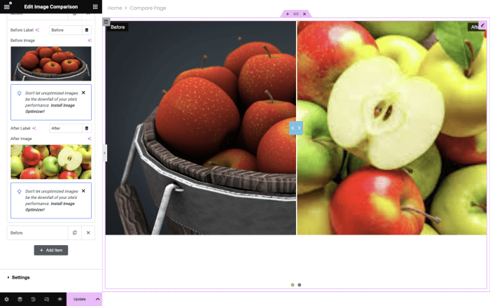
Interactive Before-and-After Comparisons
Dynamic interaction with before-and-after images enhances user engagement. This allows users to actively participate in the comparison process, leading to a more immersive and informative experience.JavaScript can be employed to create a seamless transition between the before and after images. A user-friendly interface, perhaps with buttons or a slider, allows the user to switch between the two images without refreshing the page.
This interactive element is crucial for high-impact displays, particularly in showcasing projects or transformations.
Dynamic Photo Switching Using JavaScript
Implementing dynamic photo switching with JavaScript involves several key steps. First, incorporate JavaScript code into your WordPress theme or a dedicated plugin. This code will handle the display of images and the transition effects between the “before” and “after” images.The JavaScript should handle the switching logic. For example, you could use a button or a simple click interaction to toggle between the two images.
The script should also include animation effects to smoothly switch between the images. Using transition effects like fade-in/fade-out or slide transitions provides a visually appealing and user-friendly experience. The animation duration and type can be adjusted to match the overall design aesthetic.Example JavaScript snippet (simplified):“`javascript// Assuming you have two image elements with IDs ‘beforeImage’ and ‘afterImage’const beforeImage = document.getElementById(‘beforeImage’);const afterImage = document.getElementById(‘afterImage’);function showBefore() beforeImage.style.display = ‘block’; afterImage.style.display = ‘none’;function showAfter() beforeImage.style.display = ‘none’; afterImage.style.display = ‘block’;// Example button to switch between imagesconst switchButton = document.getElementById(‘switchButton’);switchButton.addEventListener(‘click’, function() showAfter(););“`This example demonstrates basic image switching.
More sophisticated implementations can involve image galleries, sliders, and other dynamic elements to create a more engaging and interactive experience for the viewer.
Final Conclusion
In conclusion, displaying before-and-after photos effectively on your WordPress site requires careful planning and execution. From choosing your image hosting strategy to optimizing images and selecting the perfect layout, every step contributes to a compelling visual narrative. By understanding the different plugin options and responsive design considerations, you can ensure your site’s before-and-after galleries are both visually appealing and accessible to all users.
Remember to troubleshoot any issues and leverage advanced techniques to create truly interactive displays. This comprehensive guide will empower you to showcase transformations effectively.

