Hot or not check your images with heat maps sets the stage for a fascinating exploration of how visual appeal can be quantified. We’ll delve into the fascinating world of heat maps, understanding how they reveal areas of interest within an image, and how this data can be applied to evaluate visual appeal. Imagine a way to objectively determine what catches the eye—that’s the power of heat maps.
This analysis goes beyond simple aesthetics, examining the technical underpinnings of heat map generation. We’ll explore image preprocessing, the algorithms used, and different visualization techniques. The journey includes a look at how various image types respond to this analysis, and how the results can be interpreted and analyzed.
Introduction to Heat Maps in Image Evaluation
Heat maps are powerful visual tools used in image analysis to highlight areas of interest and provide a concise summary of complex data. They effectively transform numerical data, like pixel intensities or frequency counts, into a visual representation where different colors or shades correspond to different values. This allows for quick identification of patterns and anomalies within the image, making them invaluable in various fields, from medical imaging to image recognition.By assigning colors to different data values, heat maps allow for a rapid visual assessment of the data distribution across the image.
This significantly aids in the identification of important features, trends, or anomalies that might be overlooked in a raw pixel-by-pixel analysis. The use of heat maps helps researchers and analysts to efficiently navigate large datasets and make informed decisions based on the visual cues provided.
Heat Map Types and Visual Interpretation
Heat maps utilize a range of color scales to represent different types of data. These variations in color intensities convey information about the values associated with each region in the image. The most common types include temperature, intensity, and frequency heat maps.
Temperature Heat Maps
Temperature heat maps typically use a color scale ranging from cool colors (blue, green) for lower temperatures to warm colors (yellow, red) for higher temperatures. This representation is commonly used in thermal imaging, where variations in surface temperature are depicted visually. For instance, in a building’s thermal scan, areas with higher temperatures (indicated by red hues) could highlight potential insulation problems or heat loss points.
Intensity Heat Maps
Intensity heat maps represent variations in the intensity or brightness of pixels. A common color scheme might use dark colors for lower intensities and progressively brighter colors for higher intensities. This type of map is prevalent in image processing and analysis, where the emphasis is on highlighting areas with differing brightness levels. For example, in satellite imagery, intensity heat maps can be used to identify areas with varying vegetation density or land cover types.
Higher intensity areas, often displayed in brighter colors, may indicate denser vegetation.
Ever wondered how to really nail your visual marketing? Checking your images with heat maps is a fantastic way to see where people’s eyes naturally go. It’s a simple, cost-effective way to see if your images are grabbing attention, and a great way to test different layouts. Learning these kinds of techniques is similar to many marketing techniques that cost time not money, and can often produce surprisingly powerful results.
You can find more on that front at marketing techniques that cost time not money. Ultimately, a heat map analysis will help you make sure your images are doing their job – effectively communicating your message and engaging your audience.
Frequency Heat Maps
Frequency heat maps show the frequency or count of occurrences of a specific feature or event across an image. These maps are commonly used in image recognition and pattern analysis. A common color scheme might display high frequency areas with brighter colors and low frequency areas with darker colors. For instance, in a social media post analysis, a frequency heat map could highlight regions in an image that are more frequently interacted with, such as areas around people or objects.
Visual Cues for Heat Map Interpretation
Understanding the color scale is crucial for interpreting heat map data. A legend or key is typically included to clearly explain the relationship between color and the underlying data values. The intensity and saturation of the colors are also important visual cues. Darker shades typically represent lower values, while brighter shades represent higher values.
Table of Heat Map Types and Visual Interpretations
| Heat Map Type | Visual Interpretation | Common Application |
|---|---|---|
| Temperature | Cool colors (blue, green) for lower temperatures, warm colors (yellow, red) for higher temperatures. | Thermal imaging, infrared cameras. |
| Intensity | Dark colors for lower intensities, progressively brighter colors for higher intensities. | Image processing, satellite imagery, medical imaging. |
| Frequency | Brighter colors for higher frequency occurrences, darker colors for lower frequency occurrences. | Image recognition, pattern analysis, social media post analysis. |
Image Enhancement and Preprocessing: Hot Or Not Check Your Images With Heat Maps
Image preprocessing is a crucial step in any image analysis pipeline, especially when aiming for accurate heatmap generation. A poorly prepared image can lead to misleading or inaccurate heatmaps, hindering the insights you glean from the analysis. This section delves into the importance of image preprocessing, exploring various enhancement techniques, and demonstrating how to optimize your input images for meaningful heat map results.Image quality directly impacts the reliability of heat map analysis.
Noise, poor contrast, or color imbalances can distort the heatmap, making it difficult to identify the relevant regions of interest. By meticulously pre-processing the image, we can ensure that the heat map accurately reflects the features and patterns within the original image.
Importance of Image Preprocessing for Heat Map Accuracy
Preprocessing steps are vital for accurate heat map generation. By addressing issues like noise, uneven lighting, and color inconsistencies, we can enhance the clarity of the image and improve the heat map’s reliability. This, in turn, allows for a more precise and insightful interpretation of the image’s content. For instance, in medical imaging, preprocessing steps like noise reduction are critical to ensure accurate detection of anomalies, ultimately improving patient outcomes.
Image Enhancement Techniques
Several techniques can enhance image quality before heat map analysis. These include adjusting contrast, reducing noise, and correcting color imbalances. Implementing these techniques ensures that the heat map accurately reflects the important features of the image.
- Contrast Adjustment: Adjusting contrast enhances the visibility of subtle details within the image. This is particularly important for images with low contrast, where important features might be obscured. Methods like histogram equalization or adaptive histogram equalization can significantly improve contrast, leading to a clearer and more informative heat map. For example, a historical photograph with poor contrast can be enhanced to highlight details, allowing a heat map to identify key figures more precisely.
- Noise Reduction: Noise in an image can significantly affect the accuracy of heat map analysis. Various noise reduction techniques, such as median filtering or Gaussian filtering, smooth out the image while preserving important details. These techniques effectively reduce the impact of random variations in the image data, resulting in a cleaner and more reliable heat map. For example, a satellite image with high noise levels can be filtered to highlight the location of urban areas, allowing for a more accurate heat map to assess urban sprawl.
- Color Correction: Color imbalances in an image can introduce errors in heat map analysis. Color correction techniques, like white balancing or color calibration, ensure that the colors in the image are accurate and consistent. This is crucial for images where color plays a significant role in the identification of features. For instance, in a medical image, color correction can improve the accuracy of identifying tissue types, allowing the heat map to accurately pinpoint anomalies.
Methods for Improving Image Quality Before Heat Map Analysis
To ensure meaningful heat map results, careful consideration of preprocessing steps is essential. Implementing a structured approach, encompassing contrast adjustment, noise reduction, and color correction, can substantially improve the quality of the input image.
- Applying a calibrated contrast adjustment algorithm can enhance subtle features that might otherwise be missed in the heat map analysis. This ensures the heat map accurately represents the nuances within the image.
- Implementing effective noise reduction techniques, such as median or Gaussian filtering, minimizes the impact of random variations in the image data. This leads to a more accurate representation of the underlying features within the image.
- Correcting color imbalances, for example, through white balancing or color calibration, ensures that the heat map’s interpretation is not skewed by inaccurate color representations. This allows for a reliable identification of features of interest in the image.
Adjusting the Input Image for Meaningful Heat Maps
The specific preprocessing steps required depend on the characteristics of the input image and the nature of the features to be highlighted. Understanding the image’s source and intended use can help guide the selection of appropriate techniques. Consider the image’s characteristics to determine the most effective approach.
Ever wondered how to check your image’s hot spots? Heat maps can reveal where viewers focus the longest, helping you understand what elements grab attention. This is crucial for optimizing your images, but also to help keep content thieves away, as understanding audience engagement patterns can be a crucial step in protecting your work. keep content thieves away by implementing strategies to make your work less attractive for unauthorized use.
Ultimately, a good heat map analysis can make your images more impactful and potentially deter theft.
Comparison of Image Enhancement Techniques
| Technique | Effect on Heat Map Accuracy |
|---|---|
| Contrast Adjustment | Improved visibility of subtle details, leading to more accurate identification of regions of interest. |
| Noise Reduction | Reduced impact of random variations, resulting in a more reliable and accurate heat map. |
| Color Correction | Ensured accurate color representation, preventing misinterpretations in the heat map. |
Implementing Heat Map Algorithms
Heat maps, those visually appealing representations of data intensity, have become indispensable tools in image evaluation. Beyond their aesthetic appeal, heat maps provide a concise summary of intricate information, revealing patterns and anomalies that might be missed in a raw image. This section dives into the algorithms used to create these visual summaries, exploring their strengths, weaknesses, and computational implications.Understanding the underlying algorithms is crucial for choosing the right method for a specific task.
Different algorithms excel in different scenarios, and selecting the most appropriate one hinges on the nature of the data being visualized. Computational complexity is also a significant consideration, especially when dealing with large datasets.
Algorithms for Heat Map Generation
Various algorithms are used to create heat maps, each with its own strengths and weaknesses. The choice of algorithm often depends on the nature of the data and the desired level of detail in the heat map.
- Gaussian Kernel Density Estimation: This algorithm is widely used for estimating the probability density of data points within an image. It works by assigning a weight to each pixel based on its distance from the data points. The weights are determined by a Gaussian function, which gives more weight to closer points. This method is effective in highlighting areas of high concentration or density within the image, often used in object detection tasks.
A weakness of this approach is the potential for over-smoothing, potentially obscuring fine-grained details. The computational cost is generally moderate, scaling proportionally to the number of data points and the resolution of the image.
- Weighted Average: This straightforward approach calculates the average pixel intensity or value within a specific region of interest. Each pixel within the region contributes to the average according to a pre-defined weighting scheme. A strength of this algorithm is its simplicity and speed. However, it might not capture nuances in the data distribution as effectively as more complex algorithms.
The computational complexity is relatively low, as it involves simple arithmetic operations. The accuracy depends heavily on the chosen weighting scheme.
- Frequency-Based Heat Maps: These algorithms focus on the frequency of specific color components or pixel values within the image. They are useful for identifying dominant colors or recurring patterns. A significant advantage is their ability to highlight patterns that might be missed in a raw intensity-based approach. However, the interpretation of these maps requires careful consideration of the specific context.
The computational cost can vary, depending on the specific frequency analysis method used.
Comparison of Algorithms
| Algorithm | Strengths | Weaknesses | Computational Complexity |
|---|---|---|---|
| Gaussian Kernel Density Estimation | Highlights density, good for object detection | Can oversmooth, loses fine details | Moderate |
| Weighted Average | Simple, fast | Doesn’t capture nuanced data distribution | Low |
| Frequency-Based | Highlights patterns, dominant colors | Interpretation depends on context | Variable |
Factors Affecting Heat Map Accuracy
The accuracy of heat map algorithms is influenced by several factors.
- Data Resolution: Higher resolution images generally lead to more accurate heat maps, as they contain more detailed information. Low-resolution images can produce heat maps that are too coarse or inaccurate.
- Window Size/Region of Interest: The size of the region used to calculate heat map values affects the level of detail in the map. Smaller regions capture finer details but can be noisy. Larger regions provide a broader view but might lose local nuances.
- Normalization and Scaling: Ensuring data is properly normalized and scaled is essential. Different data ranges can lead to misleading interpretations of the heat map. Using appropriate normalization techniques, such as min-max scaling, can prevent this problem.
- Noise in the Image: Noisy images can lead to inaccurate heat maps. Noise can create spurious hot spots or obscure true patterns. Preprocessing steps to reduce noise, like filtering, can significantly improve accuracy.
Application of Heat Maps to “Hot or Not” Evaluations
Applying heat maps to subjective evaluations like “hot or not” can seem counterintuitive. However, by mapping visual attention and perceived appeal, heat maps offer a quantitative approach to understanding the human response to images. This technique transcends simple aesthetics, allowing for a deeper exploration of visual elements that resonate with observers.Heat maps, in this context, are more than just pretty colors; they represent the distribution of visual interest.
By overlaying these maps on images, we can identify areas that draw the most attention and potentially correlate them with perceived attractiveness. This quantitative approach can reveal patterns and insights that might otherwise be missed through purely subjective assessments.
Visual Appeal and Heat Map Correlation
Heat maps effectively quantify visual appeal by pinpointing areas of high visual attention. A high concentration of heat in a specific region of an image suggests that area is more visually engaging, potentially due to factors like color contrast, sharp edges, or a compelling composition. Conversely, a lack of heat in an area might indicate a visually uninteresting or less compelling aspect of the image.
This correlation is not absolute, as individual preferences and cultural factors can influence perceived attractiveness.
Ever wondered if your blog images are grabbing readers’ attention? Using heat maps to see where people click or linger on your images can be a game-changer. It’s like a hot or not check for your visuals! Learning how to improve blogging skills, especially when it comes to image optimization, is crucial for engagement. This guide will help you understand various techniques.
Ultimately, using heat maps to analyze image performance will help you tailor your visual content for better results.
Types of “Hot or Not” Evaluation Metrics and Heat Map Data
Various metrics can be used to assess visual appeal, and these metrics can be correlated with heat map data. For example, a “likeability” metric, based on user ratings or social media engagement, can be used to gauge the overall appeal of an image. This metric can be compared with the overall heat map intensity, where higher heat map intensity corresponds to a higher likeability score.
Other metrics, such as “attention span” (the duration a viewer spends looking at different areas of the image), can be used to determine the “hot spots” and compare them to the heat map intensity in those areas. Facial attractiveness, a crucial aspect in many “hot or not” evaluations, can be analyzed by focusing on the heat map data over specific facial features.
The areas with the highest concentration of heat in a portrait could be compared with established norms of facial attractiveness. This comparison can reveal patterns in how facial features contribute to the overall visual appeal of a portrait.
Implementing Heat Map Analysis for “Hot or Not”
A crucial step in applying heat maps to “hot or not” evaluations is the collection of user data. This data can be collected through eye-tracking studies, where participants’ gaze patterns are recorded while viewing images. The gaze data is then processed to generate heat maps, highlighting the areas of the image that captured the most attention. This process can be further refined by considering various factors, such as the participant’s demographics or prior exposure to similar images.Another important consideration is the normalization of heat map data.
Heat map intensities are often normalized to a range of 0 to 1, making comparisons across different images more meaningful. This normalization process ensures that variations in image brightness or contrast do not skew the heat map results. Furthermore, the implementation should consider potential biases in the data collection process. By understanding the potential biases, adjustments can be made to the analysis process to ensure a more accurate representation of perceived attractiveness.
Visual Representation of Heat Maps
Heat maps are powerful tools for visualizing data distributions, highlighting patterns, and identifying important regions within an image. Effective visualization is crucial for interpreting the information encoded within the heat map, transforming raw data into insights. A well-designed heat map not only communicates the intensity of data points but also encourages deeper understanding and more informed decision-making.
Choosing Color Scales
Color scales are fundamental to heat map comprehension. The right choice directly impacts how viewers perceive the data. Selecting a color scale should consider the nature of the data and the desired emphasis. For example, a sequential color scale, such as a gradient from blue to red, is ideal for representing data that increases in intensity. Conversely, a diverging color scale, with a neutral color in the middle and colors intensifying in opposite directions, is better for data with positive and negative values.
Diverging scales help highlight both high and low points simultaneously. Remember, a clear understanding of the data range and the relationship between color and intensity is critical.
Creating Effective Legends
Legends are indispensable for interpreting heat maps. They provide a crucial link between the colors displayed and the underlying data values. A well-constructed legend clearly defines the color range and the corresponding data values. It’s essential to ensure that the legend is easily readable and provides sufficient detail for accurate interpretation. For example, a legend with a color bar, alongside a numerical scale, facilitates a clear understanding of the data.
Visualizing Heat Map Data
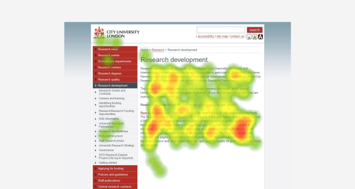
Various visualization styles can be employed to present heat map data effectively. One common style is a simple rectangular heat map, ideal for representing data across two dimensions. For example, in a “hot or not” image evaluation, the rectangular map can visually highlight regions of interest, showing high levels of approval (e.g., brighter red) and low levels of approval (e.g., cooler blue).
Another style, suitable for spatial data, is a geographical heat map, where the data is represented over a map. In this case, regions with higher intensity data values will appear with more saturated colors.
Customization Options for Heat Maps
Customizing heat map appearance can enhance its effectiveness for specific needs. For instance, you can adjust the color scheme to match the overall design of the application. Adding transparency to the colors can also improve readability, particularly when multiple heat maps are overlaid on the same image. Customizing the size and shape of the heat map cells can be useful in emphasizing specific regions of interest.
Adjustments to the color gradient can be beneficial for highlighting critical areas. For example, a “hot or not” evaluation could use a more vibrant color gradient to emphasize areas of high interest.
Table of Visualization Options
| Visualization Style | Description | Example |
|---|---|---|
| Rectangular Heat Map | Represents data across two dimensions. | Image of a face with regions colored based on approval ratings. |
| Geographical Heat Map | Represents data over a map. | Map of a city with areas colored based on crime rates. |
| Circular Heat Map | Represents data within a circular structure. | A circular image with intensity of colors representing various features. |
Interpretation and Analysis of Heat Maps

Heat maps, with their vibrant color gradients, offer a powerful visual representation of data distribution. However, simply observing the colors isn’t enough; a systematic approach to interpretation is crucial to extract meaningful insights. This section delves into strategies for extracting patterns, comparing maps, and avoiding common pitfalls in heat map analysis, ultimately empowering you to draw sound conclusions.
Strategies for Interpreting Heat Map Results, Hot or not check your images with heat maps
A key strategy in heat map interpretation is understanding the underlying data. Knowing the context of the image and the parameters used to generate the heat map is essential. For instance, if the heat map represents image attractiveness scores, understanding the criteria used to calculate these scores is vital for accurate interpretation. Are certain facial features prioritized?
Are specific poses more attractive? These factors influence the patterns you’ll see. A careful review of the data source and the algorithm employed in heat map generation is essential for a comprehensive understanding.
Identifying Patterns and Trends in Heat Map Data
Heat maps reveal patterns and trends by highlighting areas of high and low density. Look for clusters, gradients, and distinct shapes. For example, a concentrated area of high intensity in a facial image might indicate a focal point of attraction. Similarly, gradual intensity changes across a landscape image could signify gradual changes in elevation or vegetation. The presence of patterns can suggest underlying relationships and correlations within the data.
Systematic examination of these patterns is crucial to understand the data’s underlying message.
Comparing and Contrasting Heat Maps from Different Images
Comparing heat maps from different images allows for a comparative analysis of visual preferences. For example, if you are analyzing attractiveness scores across different faces, heat maps of images of individuals from different demographics can reveal cultural differences in preference. Note differences in color intensity and distribution to identify trends in attractiveness scores and preferences. Visual comparison can highlight significant variations and similarities across different samples.
By overlaying and comparing heat maps, you can pinpoint the specific areas that contribute to these differences or similarities.
Common Misinterpretations in Heat Map Analysis
A common misinterpretation is equating color intensity with absolute value. While higher intensity generally indicates higher values, the scale and range of the data must be considered. A seemingly small difference in intensity in one part of the image could represent a substantial difference in another part. Another pitfall is the over-reliance on visual patterns without considering the underlying data.
Always cross-reference heat map patterns with the original image and data to ensure that patterns aren’t simply visual artifacts. Furthermore, neglecting the limitations of the data can lead to erroneous conclusions.
Drawing Conclusions Based on Heat Map Data
Heat maps provide valuable insights, but conclusions should be drawn cautiously, recognizing the limitations of the data. For instance, correlations in heat maps can suggest associations but not necessarily causality. A correlation between a specific facial feature and attractiveness does not automatically imply a causal link. The conclusions should be supported by additional data and analysis methods.
Furthermore, consider the sample size and representativeness of the data used to generate the heat maps. Large, diverse datasets provide a more robust foundation for drawing reliable conclusions.
Considerations for Different Image Types
Heat maps, while powerful for image analysis, aren’t a one-size-fits-all solution. Different image types, from vibrant photographs to stylized illustrations, require tailored approaches to heat map generation and interpretation. Understanding these nuances is crucial for extracting meaningful insights and avoiding misleading results. Analyzing photos, paintings, and illustrations with the same heat map algorithm can yield inaccurate or skewed results, potentially obscuring critical information or misrepresenting the subject.To ensure accurate and meaningful results, heat map analysis techniques must be adjusted based on the image’s characteristics.
This involves recognizing the inherent differences in how different image types encode information and applying the most suitable heat map generation techniques. Understanding these variations and the underlying principles of heat map algorithms will significantly improve the reliability and effectiveness of the analysis.
Adjusting Heat Map Analysis for Photos
Photographic images, often rich in detail and natural lighting, necessitate a sophisticated approach to heat map generation. The algorithm should prioritize identifying areas of high concentration of color, contrast, and detail, while mitigating the impact of noise and background distractions. For instance, if the analysis focuses on human faces in a photograph, the algorithm should be trained to identify facial features like eyes, nose, and mouth.
Techniques like edge detection and color space transformations can be employed to highlight these specific regions.
Adjusting Heat Map Analysis for Illustrations
Illustrations, with their defined lines and shapes, present a different challenge. The heat map generation process should focus on highlighting areas with dense lines, intricate details, or specific color palettes. The algorithm should avoid emphasizing areas of simple shading or subtle color gradients that may not reflect the artist’s intent. For instance, if the illustration portrays a complex architectural design, the heat map should focus on identifying critical structural elements, such as corners, intersections, and windows.
Adjusting Heat Map Analysis for Paintings
Paintings, with their unique artistic style and use of color and brushstrokes, demand a more nuanced heat map approach. The algorithm should be trained to identify areas with concentrated brushstrokes, high color saturation, or unique artistic techniques. Furthermore, the algorithm should be able to distinguish between intentional artistic choices and random or accidental marks. For instance, a heat map for a landscape painting might highlight areas with dense brushstrokes representing trees or areas with intense color saturation reflecting the sky.
Comparing and Contrasting Heat Map Generation for Different Image Formats
The choice of heat map algorithm greatly impacts the results. For photos, algorithms based on color intensity or edge detection might be more suitable. For illustrations, algorithms focused on line density and shape might be more effective. In contrast, algorithms that consider brushstrokes and color saturation might be more appropriate for paintings.
Optimal Heat Map Algorithms for Different Image Types
Choosing the right algorithm is paramount. For photos, algorithms that consider color intensity and edge detection often yield the most relevant results. Illustration analysis might benefit from algorithms focusing on line density, while painting analysis could employ algorithms sensitive to brushstroke patterns and color intensity variations.
Challenges of Analyzing Images with Varying Characteristics
Analyzing images with diverse characteristics presents challenges. The variability in image content, stylistic choices, and inherent noise can lead to inaccurate or misleading heat maps. Furthermore, the subjectivity of artistic intent can affect the interpretation of heat map results. Accurately representing a subject, object, or character requires a deeper understanding of the underlying characteristics and visual patterns within the image.
Best Practices for Each Image Type
| Image Type | Heat Map Algorithm Considerations | Example Application |
|---|---|---|
| Photos | Color intensity, edge detection, noise reduction | Identifying key facial features in a portrait |
| Illustrations | Line density, shape detection, color palette analysis | Highlighting intricate details in an architectural drawing |
| Paintings | Brushstroke analysis, color saturation, artistic style recognition | Identifying the focal point of a landscape painting |
Outcome Summary
In conclusion, using heat maps to evaluate visual appeal in images opens up exciting possibilities. From image enhancement to algorithmic implementation, the process allows for a deeper understanding of what draws the eye. The results, while not a perfect science, offer valuable insights into the complex relationship between image content and human perception. This approach can be applied to a wide range of images, from personal photos to professional design projects, revealing hidden patterns in visual attraction.