Google Data Studio tutorial sets the stage for this insightful journey, offering a comprehensive guide to unlocking the power of data visualization. Learn how to transform raw data into compelling dashboards and reports using Google Data Studio. This tutorial will cover everything from setting up your account to creating advanced visualizations, including best practices and troubleshooting common issues.
Get ready to harness the potential of your data and gain actionable insights!
This tutorial will walk you through the essential steps to create professional-looking dashboards. We’ll explore diverse data sources, from Google Sheets to Google Analytics, providing practical examples and actionable advice for every step. Master the art of data storytelling with this comprehensive Google Data Studio tutorial.
Introduction to Google Data Studio
Google Data Studio is a powerful, user-friendly business intelligence tool that allows users to connect to various data sources, transform and analyze the data, and then create interactive dashboards and reports. It’s designed to provide clear visualizations and insights from raw data, empowering users to make data-driven decisions. Data Studio is more than just a visualization tool; it’s a platform for turning data into actionable knowledge.Data Studio excels at simplifying complex data sets.
Its drag-and-drop interface and pre-built templates make it accessible to individuals with varying technical expertise, from analysts to executives. The tool streamlines the process of extracting insights, allowing users to quickly generate reports and dashboards that answer key business questions.
Definition of Google Data Studio
Data Studio is a cloud-based business intelligence (BI) tool offered by Google. It facilitates the creation of interactive data visualizations, dashboards, and reports. This platform allows users to connect to various data sources, process data, and transform it into insightful presentations.
Purpose and Key Functionalities
Data Studio’s primary purpose is to transform raw data into actionable insights. Its key functionalities include data source connection, data transformation, visualization design, and report sharing. Users can connect to diverse data sources, including Google Analytics, Google Sheets, and other cloud-based platforms. Once connected, users can manipulate the data using formulas and calculations. Data Studio’s extensive visualization options enable users to present data in charts, graphs, and maps.
These visualizations can be combined into interactive dashboards, allowing users to explore data dynamically and gain deeper insights. Furthermore, the platform allows for seamless report sharing and collaboration.
Target Audience
Data Studio’s user-friendly interface and diverse functionalities make it suitable for a broad range of users. This includes business analysts, marketing professionals, sales teams, and even executive leadership. The platform is designed to meet the needs of those who need to analyze data, create reports, and share insights across teams or departments. It’s a powerful tool for everyone from the individual analyst to the senior executive.
Brief History of Google Data Studio
Data Studio launched in 2017 as a part of Google’s suite of business tools. Prior to its official release, it was known internally as Google’s Data Visualization tool. Its development focused on providing a user-friendly interface and a wide range of visualization options. The goal was to make data analysis accessible to a broader audience, beyond technical experts.
Data Studio quickly gained popularity due to its intuitive design and ability to connect to various data sources. The platform continues to evolve, with frequent updates and improvements to its features.
Comparison of Data Studio to Other Visualization Tools
| Feature | Data Studio | Tableau | Power BI |
|---|---|---|---|
| Ease of Use | High, drag-and-drop interface | Medium, requires some learning | Medium, intuitive but some complexity |
| Data Sources | Extensive, including Google products | Very extensive, various databases | Very extensive, wide range of data connectors |
| Visualization Options | Good selection, suitable for many use cases | Extensive, powerful customization | Excellent, advanced features |
| Collaboration Features | Good, shared dashboards and reports | Excellent, robust collaboration features | Very good, user-friendly sharing |
| Pricing | Free tier available, paid tiers for more features | Subscription-based pricing, various plans | Subscription-based pricing, various plans |
This table provides a general comparison of Data Studio to two popular data visualization tools. The features, ease of use, and pricing models can vary depending on specific use cases and needs.
Setting Up a Data Studio Account
Getting started with Google Data Studio involves setting up a user account and connecting it to data sources. This process is straightforward and essential for leveraging Data Studio’s capabilities. A well-structured account allows you to easily manage reports, visualize data, and share insights with others.Data Studio’s intuitive interface simplifies the process of creating and sharing reports. From basic dashboards to complex analyses, Data Studio provides a flexible platform for visualizing and communicating data effectively.
Creating a Data Studio Account
To establish a Data Studio account, you must have a Google account. If you don’t have one, creating a Google account is a prerequisite. This account will serve as your access point for all Data Studio activities. The process is identical to creating any other Google account.
Account Information Requirements
The necessary information for creating a Data Studio account is the same as for any other Google service. This includes a valid email address, a strong password, and verification of your identity, if required. Consider using a unique and memorable password for better security.
Learning Google Data Studio is a fantastic way to visualize data, but sometimes technical SEO issues can get in the way. For instance, if you’re building a client-side React app, you might need to address things like proper structured data implementation and correct handling of crawlable content. A great resource for tackling these issues is this comprehensive guide on how to fix technical SEO issues on client-side React apps.
Once you’ve got your React app’s SEO in order, you can use Google Data Studio to create stunning dashboards to showcase your insights.
Navigating the Data Studio Interface
Data Studio’s interface is designed for ease of use. The dashboard displays key elements for managing reports and data connections. The top menu provides options for creating new reports, connecting to data sources, and sharing reports. The sidebar allows you to access previously created reports, making navigation straightforward. The main work area displays the current report, allowing you to add charts, tables, and other visual elements.
Connecting to Data Sources
Connecting to data sources is crucial for building reports in Data Studio. The platform supports various data sources, allowing you to visualize data from diverse sources. Understanding how to connect to different data sources will enable you to utilize Data Studio’s full potential.
Connecting to Google Sheets
Connecting to Google Sheets involves authenticating your Google account with Data Studio. Select “Connect a data source” in the Data Studio interface. Choose “Google Sheets” from the list of available options. Select the desired spreadsheet and specify the relevant sheet to be used for the report.
Connecting to Google Analytics
Connecting to Google Analytics is a similar process. In the Data Studio interface, select “Connect a data source” and choose “Google Analytics.” Authorize Data Studio to access your Analytics data. Specify the desired view for data retrieval.
Connecting using Other Methods
Data Studio supports other data sources like BigQuery, Salesforce, and more. The steps for connecting to each vary. Data Studio typically guides you through the authentication and configuration process for each data source. The platform offers tutorials and documentation to assist in setting up connections with different data sources.
Importing and Preparing Data
Data is the lifeblood of any insightful analysis. In Google Data Studio, effectively importing and preparing data is crucial for creating compelling visualizations and drawing meaningful conclusions. This process involves fetching data from various sources, meticulously cleaning it, transforming it into a usable format, and organizing it for visualization. Mastering these techniques empowers you to unlock the full potential of your data within Data Studio.Data from various sources needs careful handling before it can be effectively visualized.
This section details the crucial steps involved in importing, cleaning, transforming, and organizing data for your Data Studio dashboards.
Data Import from Different Sources
Data Studio supports a wide range of data sources, including Google Sheets, Google Analytics, BigQuery, and many more. The import process varies slightly depending on the source. For instance, importing data from a Google Sheet is typically straightforward, requiring only a connection and specifying the sheet. However, importing from a database or a custom API may require more configuration.
Understanding the specific import procedures for each source is paramount for a successful import.
Data Cleaning and Transformation
Data often arrives in a messy state, with inconsistencies, errors, and irrelevant data points. Data cleaning involves identifying and correcting these issues, improving data quality, and preparing it for analysis. Transformation techniques involve changing the data structure, formatting, and content to match your specific needs. For example, you might need to standardize date formats, convert currencies, or combine data from multiple columns.
Robust cleaning and transformation are fundamental for creating accurate and reliable visualizations.
So, you’re diving into Google Data Studio tutorials? That’s fantastic! To really leverage your data insights, exploring must-have Salesforce apps like these can be a game-changer. Knowing how to connect and utilize the right data sources, whether Salesforce or otherwise, is key for getting the most out of your Google Data Studio dashboards. Mastering these tools will set you up for success.
Data Preparation Best Practices
Adhering to best practices during data preparation is vital for producing high-quality dashboards. This involves meticulously documenting the data transformations, maintaining consistent data types, and ensuring data accuracy. Properly structuring the data is essential for building intuitive and effective dashboards. For instance, ensuring your data is appropriately formatted for the desired visualization type is a critical step.
A meticulously prepared dataset will lead to more reliable and insightful visualizations.
- Data Validation: Regularly validating the data against predefined rules is essential to identify and correct potential issues before they impact your analysis. This might involve checking for missing values, ensuring data types are consistent, or confirming data ranges fall within acceptable bounds.
- Data Consistency: Ensuring data consistency across different sources and time periods is crucial for reliable analysis. Standardizing units, formats, and naming conventions are vital steps.
- Data Filtering: Focusing on the relevant subset of data is critical for generating actionable insights. Filtering out irrelevant data points can significantly improve the efficiency and accuracy of your visualizations.
Common Data Import Errors and Solutions, Google data studio tutorial
Several errors can occur during data import. One common error is a mismatch in data types between the source and Data Studio. For instance, importing a date as a string might lead to incorrect calculations. Understanding the data types and formats expected by Data Studio is critical to avoid such errors. Another potential error is an incorrect connection string or insufficient permissions.
Carefully reviewing the connection details and ensuring the correct user permissions are in place can prevent such issues.
Filtering and Organizing Data
Filtering and organizing data before creating visualizations is crucial for isolating the relevant information. This allows for more focused analysis and enables the creation of dashboards that are both informative and easily understood. For example, filtering sales data by region can help you understand regional performance variations. This step helps ensure the visualizations accurately represent the intended scope of analysis.
Creating Visualizations
Transforming raw data into compelling visuals is key to extracting insights and effectively communicating findings in Google Data Studio. Mastering chart selection and customization empowers you to tell a compelling story with your data. Choosing the right visualization type is crucial for clarity and impact.Effective visualizations are more than just pretty pictures; they’re powerful tools for understanding trends, patterns, and outliers within your data.
This section will guide you through selecting the best chart types for various data sets, customizing their appearance, and leveraging them for interactive storytelling.
Chart Types Available in Data Studio
Data Studio offers a diverse range of chart types, each designed to represent data in a specific way. Understanding the strengths and weaknesses of each type is vital for creating insightful visualizations. Common chart types include bar charts, line charts, pie charts, scatter plots, area charts, and more specialized options. Each type effectively displays different kinds of data, from simple comparisons to complex relationships.
Choosing the Right Chart for Your Data
Selecting the appropriate chart type depends on the nature of your data. For instance, bar charts excel at comparing categorical data, like sales figures across different regions. Line charts are ideal for showcasing trends over time, such as website traffic growth. Pie charts are effective for visualizing proportions within a whole, such as the market share of different products.
Scatter plots are well-suited for identifying correlations between two variables, while area charts highlight cumulative data changes. The key is to match the chart to the story you want to tell.
Customizing Chart Appearance
Data Studio allows for significant customization of chart aesthetics. Adjusting colors, fonts, labels, and annotations allows you to create visualizations that are both informative and visually appealing. Consider the target audience and the message you want to convey when making these adjustments. Consistent formatting and clear labeling are essential for effective communication.
Chart Customization for Storytelling
Customizing colors, fonts, and labels significantly enhances a chart’s ability to convey a narrative. Choosing colors that evoke the desired emotions and using clear, concise labels helps ensure the message is communicated effectively. For instance, using a gradient to highlight a trend or a specific color to emphasize key data points can strengthen the story. A consistent color scheme throughout your visualization dashboard helps create a unified message.
Interactive Visualizations
Data Studio’s interactive features allow users to explore data in more depth. Interactivity can enhance the user experience by enabling dynamic filtering, highlighting, and drill-down capabilities. For example, users can filter data by specific categories to see detailed insights within different segments. Interactivity encourages deeper engagement with the data, fostering a more in-depth understanding.
Building Dashboards and Reports
Bringing your data to life in Google Data Studio involves more than just creating visualizations. Dashboards and reports are the final pieces, allowing you to present your insights in a compelling and actionable way. This section delves into the crucial steps of dashboard creation, arrangement, and design best practices, along with report generation.Effective dashboards and reports transform raw data into digestible, strategic information.
They condense key metrics and visualizations into a single view, enabling users to quickly grasp trends, patterns, and exceptions. Well-designed dashboards facilitate quick analysis and informed decision-making.
Creating a Dashboard
To construct a dashboard, you first need to identify the key performance indicators (KPIs) and metrics you want to track. These will form the basis of your visualizations. Next, select the appropriate visualizations from the available options in Data Studio, ensuring they effectively represent the chosen metrics. The design process involves choosing a layout, arranging components strategically, and refining the visual appeal for maximum clarity.
Importantly, dashboards should be user-centric, ensuring clear and concise presentation of data.
Arranging Components and Widgets
The arrangement of widgets on a dashboard significantly impacts its usability. Using a grid-based layout is often helpful in aligning widgets, optimizing space, and maintaining a clear hierarchy. Consider the flow of information and the natural progression of analysis when positioning elements. Good dashboard design principles often include a clear visual hierarchy, where critical information is emphasized through size, color, and placement.
This approach guides the user’s eye and aids comprehension.
Best Practices for Dashboard Design and Layout
A well-designed dashboard prioritizes clarity and ease of understanding. Color palettes should be chosen carefully, ensuring they enhance readability and don’t create visual clutter. A consistent style across widgets enhances the overall aesthetic and aids in information processing. Use appropriate labeling and annotations to clarify the meaning of each visualization. Avoid overwhelming the user with excessive data or too many elements on a single dashboard.
So, you’re diving into Google Data Studio tutorials? Knowing how to effectively communicate the value of your data visualizations is crucial. Understanding the importance of a strong value proposition, like clearly articulating why your data insights matter to stakeholders, is key for any data-driven strategy. Check out this helpful resource on importance of value propositions for more insights.
Ultimately, mastering Google Data Studio hinges on presenting your findings in a way that resonates and drives action, not just displaying pretty charts.
Keep it concise and focused.
Different Types of Dashboards
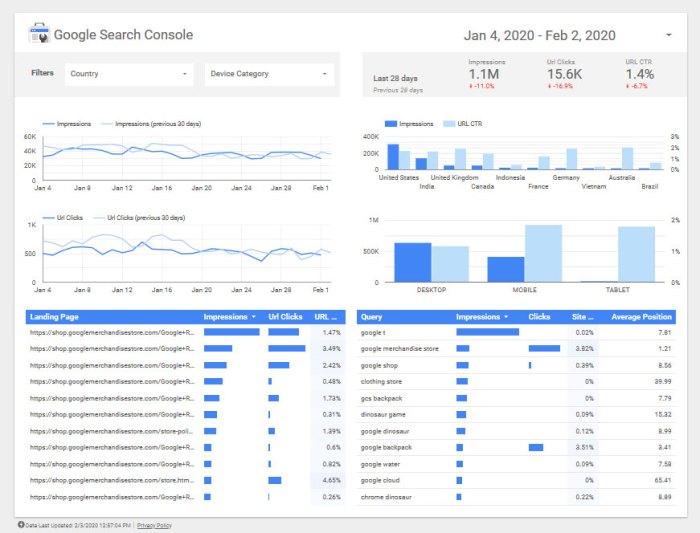
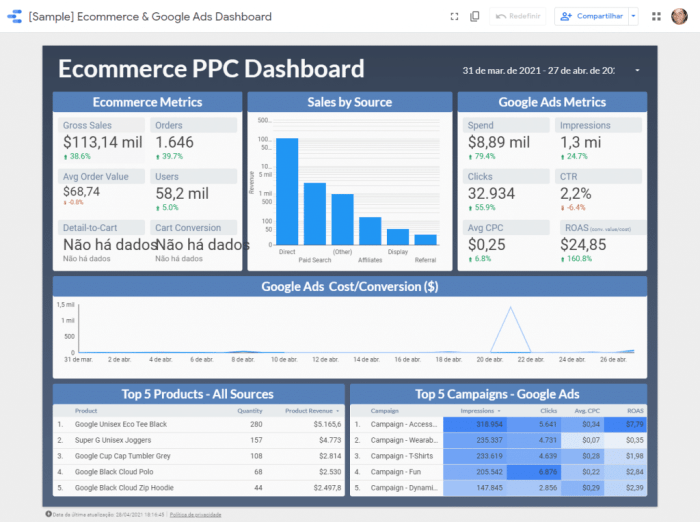
Dashboards can be tailored to various use cases. A marketing dashboard might display website traffic, conversion rates, and social media engagement metrics. A sales dashboard could showcase sales figures, customer acquisition costs, and revenue trends. A financial dashboard would display key financial metrics, such as profit margins, cash flow, and investment returns. Each dashboard type should be tailored to the specific needs and objectives of its intended audience.
Consider the role and experience level of the users when designing each type.
Creating Reports from Dashboards
Once you’ve crafted your dashboard, you can generate reports from it. Data Studio allows you to export the dashboard as a static image or embed it into a website. Exporting as a static image provides a snapshot of the dashboard at a particular point in time. Embedding it in a website offers dynamic updating, providing a live representation of the data.
Exporting allows for sharing, while embedding allows for integration into other platforms. Consider the desired use and distribution method for your data.
Advanced Features
Google Data Studio offers a powerful suite of advanced features that go beyond basic visualizations. These features unlock the full potential of your data by allowing you to create more sophisticated dashboards, perform complex analysis, and tailor your reports to your specific needs. Mastering these advanced tools empowers you to gain deeper insights from your data and present them effectively.
Calculated Fields
Calculated fields enable you to perform complex calculations directly within Data Studio. This allows you to derive new metrics and insights that aren’t readily available in your source data. Instead of relying on external tools, you can perform calculations within the platform, ensuring consistency and accuracy. For example, you can calculate the percentage change in sales between quarters, or create a customer lifetime value metric by summing up all purchases a customer has made.
Custom Visualizations
Custom visualizations extend the built-in visualization options, offering more flexibility in displaying your data. This allows you to create visualizations that precisely meet your needs and present your findings in an engaging manner. For instance, if you require a specific type of chart not included in Data Studio’s standard library, you can create a custom visualization using JavaScript or other scripting languages.
Filters and Parameters
Filters and parameters empower dynamic data exploration within your dashboards. Filters allow users to narrow down the data displayed in visualizations, while parameters allow you to control the filters dynamically, making it easier to compare different scenarios and create interactive reports. Parameters provide a way to select specific values or ranges, enabling users to explore the data with different criteria.
For example, users can select a specific region to focus on or a particular date range.
Sharing Dashboards and Reports
Sharing dashboards and reports is essential for collaboration and knowledge sharing. Data Studio provides various sharing options, allowing you to grant specific permissions to different users, ensuring that only authorized individuals can access and modify your dashboards and reports. This is especially important for teams working on data analysis projects, as it promotes effective communication and collaboration.
Scheduling Reports and Notifications
Scheduled reports and notifications streamline data analysis workflows. Data Studio allows you to schedule reports to be generated automatically at specified intervals, providing regular updates on key metrics. You can also set up email notifications to alert you or other stakeholders when critical thresholds are crossed or significant changes occur. This helps in staying informed about trends and potential issues.
Embedding Data Studio Reports
Embedding Data Studio reports on other websites allows for seamless integration with existing platforms and workflows. This feature enables you to present your data insights in a more integrated manner and improve data accessibility. For example, you can embed a Data Studio dashboard on your company intranet or website, allowing employees or clients to view the information without needing a separate Data Studio account.
Troubleshooting and Common Issues
Data Studio, while powerful, can present challenges. Understanding common pitfalls and how to address them is crucial for effective use. This section delves into troubleshooting data connection problems, visualization errors, and performance issues, equipping you with the tools to confidently navigate potential obstacles.Troubleshooting data connection problems often involves a methodical approach. Incorrect data source configurations, authorization issues, or network problems can all lead to connection failures.
This section provides step-by-step solutions to identify and resolve these issues, ultimately ensuring your data is accessible.
Data Connection Problems
Data connection errors are frequent, and often stem from misconfigurations or network difficulties. Correcting these errors requires careful attention to detail. Reviewing the data source settings and verifying authentication credentials is crucial.
- Verify Data Source Configuration: Double-check that the data source details (like the URL, username, password) are accurately entered in Data Studio. Incorrect entries are the most common cause of connection failures. Ensuring consistency between the data source and Data Studio configuration is paramount.
- Authentication Issues: If authentication is required, verify the credentials. Ensure the user account has the necessary permissions to access the data source. Common causes include incorrect passwords or insufficient access rights.
- Network Problems: Verify network connectivity to the data source. Intermittent network issues or firewalls can impede connections. Try accessing the data source directly using a different application to confirm network accessibility.
Visualization-Related Errors
Visualization errors can stem from various factors, including data type mismatches, incorrect chart types, or incompatible data structures. Addressing these errors directly improves the quality of visualizations.
- Data Type Mismatches: Ensure that the data type in the data source matches the expected data type for the visualization. For example, a bar chart may not accept dates as values. Data Studio often requires specific data types for various chart types. Correcting this involves transforming data types if necessary.
- Incorrect Chart Type: Select a chart type that effectively represents the data. A line chart might not be appropriate for categorical data. Carefully choose the right chart type to accurately reflect the underlying data structure and insights.
- Incompatible Data Structures: Ensure that the data structure in the data source is compatible with the visualization. If the data is in a different format than expected, transform the data accordingly. Inconsistencies in data structures often lead to errors in Data Studio.
Troubleshooting Performance Issues
Performance issues in Data Studio are frequently linked to large datasets, complex queries, or poorly optimized dashboards. Addressing these problems can dramatically improve the user experience.
- Large Datasets: With large datasets, consider breaking down the data into smaller, more manageable portions. Using calculated fields or filters to narrow down the data can greatly enhance performance.
- Complex Queries: Simplify complex queries that retrieve too much data. Optimizing the SQL queries used for data retrieval is key. Break down complex queries into smaller, more manageable parts for better efficiency.
- Poorly Optimized Dashboards: Avoid excessive use of complex visualizations and excessive layering on a single dashboard. Remove unnecessary visualizations to optimize dashboard load times. Optimizing dashboards is crucial for improved performance.
Optimizing Dashboard Performance
Optimizing Data Studio dashboards for performance involves several strategies. Efficient use of filters, calculated fields, and data structuring is essential.
- Filtering Data: Use filters to restrict the data displayed on the dashboard, reducing the amount of data processed. Using filters selectively can substantially enhance the performance of a Data Studio dashboard.
- Calculated Fields: Employ calculated fields to perform computations on the data and reduce the amount of data retrieved. Using calculated fields effectively reduces the processing load on Data Studio.
- Data Structure: Optimize the data structure to enhance query efficiency. Well-structured data often leads to more efficient data retrieval and visualization.
Case Studies and Examples: Google Data Studio Tutorial

Data Studio isn’t just a tool; it’s a powerful engine for turning raw data into actionable insights. This section dives into real-world examples of how businesses leverage Data Studio to gain a competitive edge, from optimizing marketing campaigns to improving customer service. We’ll explore effective dashboards and demonstrate how to use data visualization to communicate key findings.Understanding the nuances of data visualization is crucial for effectively communicating insights.
This section will show how to use Data Studio to craft compelling dashboards that transform complex data into easily digestible summaries. From identifying trends to spotting anomalies, effective data visualization is the key to unlocking the full potential of your data.
Real-World Applications of Data Studio
Businesses across various sectors are using Data Studio to address critical business questions. Retailers use it to track sales performance across different product categories, identifying best-selling items and areas for improvement. E-commerce companies utilize it to monitor website traffic, conversion rates, and customer behavior, allowing them to optimize their online strategies. Marketing teams use Data Studio to analyze campaign performance, assess return on investment (ROI), and refine their targeting strategies.
Data Visualization for Different Industries
The right visualization can dramatically improve comprehension of data, enabling informed decision-making. This table presents a few examples of effective data visualizations tailored to different industries.
| Industry | Data Point | Visualization Type | Example Insight |
|---|---|---|---|
| Retail | Sales by Product Category | Stacked Bar Chart | Identifies top-performing product categories for targeted promotions. |
| E-commerce | Website Traffic Sources | Pie Chart | Highlights the most effective channels driving traffic to the website. |
| Marketing | Campaign ROI | Line Chart | Tracks the ROI of different marketing campaigns over time, enabling budget allocation adjustments. |
| Finance | Stock Performance | Area Chart | Visualizes stock price fluctuations over a period, providing insights into market trends. |
| Healthcare | Patient Demographics | Choropleth Map | Visualizes the distribution of patients across different geographical regions. |
Effective Dashboard Design Principles
Creating a well-structured dashboard is crucial for effective data communication. Here are key principles for designing dashboards that drive action:
- Clarity and Conciseness: Focus on presenting only the most relevant data points to avoid overwhelming the viewer. Use clear labels, concise titles, and well-defined visual elements.
- Visual Appeal: Choose visualizations that effectively communicate the data without being overly complex or cluttered. Consider using colors and typography that are both appealing and easy to understand.
- Interactivity: Design dashboards with interactive elements that allow users to drill down into specific data points, explore different perspectives, and filter data for specific needs. This fosters deeper analysis and engagement.
- Consistency: Maintain a consistent design style and layout throughout the dashboard to ensure a cohesive and professional presentation.
Data Visualization Best Practices
These guidelines ensure the accuracy and clarity of data visualizations.
- Choose the Right Visualization: Select the visualization type that best represents the data. A bar chart might be ideal for comparing values, while a line chart is better for tracking trends over time.
- Use Clear and Concise Labels: Avoid ambiguity by using clear and concise labels for axes, titles, and legends. This improves comprehension and reduces misinterpretations.
- Maintain Data Integrity: Ensure the data displayed accurately reflects the source data. Verify calculations and avoid any errors that might misrepresent the information.
- Consider the Audience: Design visualizations with the target audience in mind. Choose visualizations that are accessible and easy to understand for the intended users.
Concluding Remarks
In conclusion, this Google Data Studio tutorial provides a complete roadmap for effectively utilizing Google Data Studio. From account setup to advanced features, we’ve covered a broad spectrum of topics to equip you with the skills to create insightful dashboards and reports. By mastering these techniques, you can transform raw data into actionable insights, enhancing decision-making and driving business success.
We encourage you to practice and explore the possibilities!