Expert Google Analytics reports go beyond basic dashboards, diving deep into your data to reveal actionable insights. These reports aren’t just about numbers; they’re about understanding your audience, optimizing your marketing strategies, and ultimately, boosting your business performance. This guide will walk you through creating expert Google Analytics reports, from defining the key metrics to crafting compelling visualizations and actionable recommendations.
We’ll explore the crucial metrics that drive actionable insights, how to effectively visualize them for maximum impact, and delve into advanced analysis techniques like cohort analysis. Learn how to identify and interpret anomalies in your data, translate insights into actionable recommendations, and organize your reports for maximum clarity and impact. We’ll also examine various report structures, real-world scenarios, case studies, and essential tools that can elevate your Google Analytics reporting to the next level.
Defining Expert Google Analytics Reports

Expert Google Analytics reports go beyond basic dashboards to provide actionable insights. They delve deeper into the data, identifying trends, patterns, and anomalies that impact business performance. Instead of simply presenting raw data, these reports offer interpretations, recommendations, and strategic implications, helping businesses make informed decisions. These reports are tailored to specific business objectives, using advanced techniques and visualizations to showcase critical information in a clear and concise manner.
Characteristics of Expert Google Analytics Reports
Expert reports are distinguished by their depth of analysis and focus on actionable insights. Basic reports often present data in a simple format, while expert reports use advanced segmentation, custom dimensions, and advanced metrics to provide a nuanced understanding of user behavior and business performance. Expert reports are not just about reporting what happened; they explorewhy* it happened and what the implications are for future strategy.
They connect data points to business objectives and translate data insights into strategic recommendations.
Key Performance Indicators (KPIs) in Expert Reports
Expert reports typically include a comprehensive set of KPIs that are directly tied to business objectives. These KPIs aren’t just limited to website traffic metrics. They might include conversion rates, customer lifetime value (CLTV), return on ad spend (ROAS), and other metrics that directly impact the bottom line. They also often incorporate data from multiple sources to provide a holistic view of the business performance.
For example, linking website traffic data with sales data from a CRM system to understand the customer journey and identify bottlenecks.
Comparison of Basic and Expert Reports
| Feature | Basic Report | Expert Report |
|---|---|---|
| Data Presentation | Simple charts and tables showing basic website metrics (e.g., page views, bounce rate). | Interactive dashboards with advanced visualizations, custom segments, and granular breakdowns. Includes custom dashboards and interactive filters for deep dives into specific data points. |
| Analysis | Descriptive, focusing on what happened. Often limited to identifying high-level trends. | Diagnostic, exploring thewhy* behind the data. Explores the relationship between different variables, identifies patterns and anomalies, and contextualizes findings within the business context. Identifies root causes and provides potential solutions. |
| Metrics | Standard metrics like page views, bounce rate, and sessions. | Comprehensive metrics relevant to business objectives, such as conversion rates, customer lifetime value (CLTV), return on ad spend (ROAS), and revenue per visitor. |
| Actionable Insights | Limited to general recommendations like improving website design or content. | Specific, data-driven recommendations, often including suggested improvements and next steps. Clearly Artikels the potential impact of implementing the recommendations. |
| Focus | Broad overview of website performance. | Targeted analysis of specific aspects of the business impacting key performance indicators. |
Example of a Strategic Recommendation from an Expert Report
An expert report might reveal that a specific marketing campaign is underperforming despite high traffic. Instead of just reporting the low conversion rate, the expert report would investigate the reasons behind the low conversion. For instance, it could find that the landing page is not optimized for the target audience or that the ad copy is not compelling enough.
The report would then suggest changes to the landing page, ad copy, and targeting strategies to improve performance and provide a clear path forward for achieving business objectives. This detailed analysis, including identifying the root cause of the issue and suggesting solutions, is a hallmark of an expert Google Analytics report.
Key Metrics and Data Visualization

Unlocking the power of Google Analytics data hinges on understanding and visualizing key metrics. Effective visualizations transform raw numbers into compelling narratives, revealing trends, patterns, and actionable insights. This section delves into the crucial metrics that drive meaningful conclusions and demonstrates how to effectively portray them for maximum impact.
Crucial Metrics for Actionable Insights
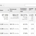
The foundation of any successful Google Analytics analysis lies in selecting the right metrics. These metrics provide the raw data to understand user behavior, campaign performance, and website effectiveness. Essential metrics include website traffic (sessions, users, bounce rate), conversion rates, user engagement (time on site, pages/session), and revenue generated. Understanding these metrics provides a comprehensive view of website performance.
Data Visualization for Maximum Impact
Visualizing these metrics is paramount for extracting meaningful insights. Charts and graphs effectively communicate trends and patterns, allowing for quick comprehension of data. A well-designed visualization immediately highlights key performance indicators (KPIs), enabling data-driven decisions. Effective visualization goes beyond simple bar charts or line graphs; it necessitates careful selection of appropriate chart types and clear labeling for maximum clarity.
Compelling Visualizations for Trend Identification
Choosing the right chart type is critical for effectively highlighting trends. For example, a line graph is ideal for illustrating website traffic over time, showing seasonal fluctuations or long-term growth. A bar chart is suitable for comparing conversion rates across different marketing channels, while a pie chart effectively showcases the breakdown of traffic sources. A combination of these visualization methods provides a more comprehensive and insightful picture of the data.
Advanced Segmentation and Custom Dimensions
Going beyond standard metrics, advanced techniques like segments and custom dimensions unlock deeper insights. Segments allow for filtering data based on specific criteria, such as user demographics, device type, or geographic location. Custom dimensions enable the tracking of specific user attributes or campaign characteristics, providing a more granular understanding of user behavior and campaign effectiveness.
Example: Identifying Seasonal Traffic Fluctuations
Imagine a website selling winter clothing. A line graph showcasing website traffic over a 12-month period clearly reveals a spike in traffic during the winter months. This trend is further amplified by adding segments based on geographic location. By combining these insights, the company can optimize inventory, marketing campaigns, and customer service strategies for peak seasonality.
Example: Understanding User Journey
A funnel visualization, tracing the steps a user takes from landing page to conversion, highlights potential drop-offs and friction points in the user journey. Adding segments based on user demographics or device type reveals if certain segments are experiencing issues at specific stages. Understanding the user journey helps in optimizing the website experience for all user groups.
Visualization Types Table
| Visualization Type | Description | Example Use Case |
|---|---|---|
| Line Graph | Shows trends over time. | Website traffic growth over the past year. |
| Bar Chart | Compares categories. | Conversion rates across different marketing campaigns. |
| Pie Chart | Shows proportions of a whole. | Breakdown of traffic sources (e.g., organic, paid, referral). |
| Funnel Chart | Tracks user progress through a series of steps. | Analyzing the conversion funnel for e-commerce websites. |
| Scatter Plot | Shows the relationship between two variables. | Correlation between time spent on site and conversion rate. |
Advanced Analysis Techniques
Diving deeper into Google Analytics data unlocks hidden patterns and actionable insights. Beyond basic metrics, advanced analysis techniques reveal the “why” behind the numbers, empowering data-driven decisions. These techniques go beyond simple reporting and allow us to understand user behavior in greater detail, identifying trends and anomalies that might otherwise go unnoticed.
Cohort Analysis
Cohort analysis groups users based on shared characteristics or experiences, like date of acquisition or specific campaign engagement. By tracking these cohorts over time, you can observe their behavior and engagement patterns. This allows for a granular view of how different user segments interact with your website or app. For example, understanding how a cohort of users acquired through a particular marketing campaign performs over the following months reveals vital information about campaign effectiveness and long-term user engagement.
Anomaly Detection
Identifying anomalies, or unexpected deviations from typical user behavior, is crucial for proactive problem-solving. By analyzing the data for unusual spikes or dips in key metrics, you can pinpoint issues that may affect conversion rates or user experience. For instance, a sudden drop in bounce rate might indicate a successful update to your website’s design or user interface, or it might signify a technical issue or a poorly-performing advertisement.
This technique requires establishing baseline patterns for comparison.
Predictive Modeling
Predictive modeling uses historical data to forecast future outcomes. By identifying trends and patterns, you can predict future user behavior, such as churn rate or conversion likelihood. This allows for proactive measures to be taken, such as targeted interventions to retain high-risk users or optimized marketing campaigns. For example, a retailer could use predictive modeling to anticipate peak demand periods and adjust inventory accordingly, preventing stockouts and lost sales.
Comparison of Analysis Methods
| Method | Description | Use Case |
|---|---|---|
| Cohort Analysis | Groups users based on shared characteristics (e.g., acquisition date) and tracks their behavior over time. | Understanding user engagement patterns, campaign performance, customer lifetime value. |
| Anomaly Detection | Identifies unusual deviations from typical user behavior by comparing current data to established baselines. | Troubleshooting issues, identifying technical problems, evaluating marketing campaign effectiveness. |
| Predictive Modeling | Forecasts future outcomes by identifying trends and patterns in historical data. | Predicting churn rate, estimating conversion likelihood, optimizing resource allocation. |
Actionable Recommendations: Expert Google Analytics Reports
Turning raw Google Analytics data into actionable strategies is crucial for achieving business objectives. Simply identifying trends isn’t enough; you need to translate those insights into concrete steps that drive improvement. This section will delve into the process of crafting effective recommendations based on your data analysis.
Expert Google Analytics reports are crucial for understanding website performance, but often, the data itself can be flawed. Understanding potential issues like those detailed in google analytics data errors is key to creating accurate and reliable reports. High-quality reports, built on solid data, are the ultimate goal, and careful attention to detail is vital for this.
Translating Insights into Recommendations, Expert google analytics reports
Effective recommendations bridge the gap between data analysis and business strategy. They are not just summaries of findings; they are specific, actionable steps that address identified opportunities and threats. This requires a deep understanding of both the data and the broader business context. For instance, a high bounce rate might be due to a poorly designed landing page, a lack of clear calls to action, or even technical issues.
Recommendations should pinpoint the likely cause and suggest a solution.
Importance of Clear and Concise Recommendations
Clear and concise recommendations are paramount for successful implementation. Ambiguous or overly complex recommendations hinder adoption and lead to confusion. They must be easily understandable by non-technical stakeholders, allowing for effective communication and buy-in. Avoid jargon and technical terms where possible, and focus on the impact of each recommendation on specific business goals. A well-crafted recommendation clearly Artikels the problem, the proposed solution, and the expected outcome.
Examples of Well-Structured Recommendations
A well-structured recommendation clearly Artikels the problem, the proposed solution, and the expected outcome. For example, “Improve mobile site speed to reduce bounce rate by implementing a content delivery network (CDN).” This recommendation is clear, specific, and measurable. Another example: “Increase social media engagement by creating a more interactive content calendar, with a focus on user-generated content.” This focuses on a specific area of improvement, proposes a practical solution, and links to the objective of higher engagement.
Linking Insights to Business Objectives
Every recommendation should be directly linked to a specific business objective. For instance, if the objective is to increase conversions, a recommendation to optimize the checkout process would be directly aligned. This connection demonstrates the value of the analysis and provides a clear path towards achieving desired outcomes. Strong recommendations are tailored to the specific needs of the business, taking into account factors like budget, resources, and time constraints.
Actionable Recommendations Table
| Insight | Recommendation | Impact |
|---|---|---|
| High bounce rate on product pages (45%). | Optimize product page layouts, improve image quality, and add more high-quality product descriptions. | Reduced bounce rate, increased average order value, and higher conversion rates. |
| Low organic traffic from mobile devices. | Conduct research focused on mobile-friendly searches, and improve site speed on mobile. | Increased organic traffic from mobile devices, leading to more conversions and brand awareness. |
| Low engagement on social media posts (below 2%). | Conduct A/B testing on different social media post formats, and incorporate user-generated content to increase engagement and brand affinity. | Increased engagement rates, higher click-through rates, and more social media shares. |
Report Structure and Organization
Crafting a compelling Google Analytics report goes beyond simply presenting data. A well-structured report is easily digestible, highlighting key insights and driving actionable recommendations. The organization directly impacts the report’s effectiveness in communicating valuable information to stakeholders.A logical and user-friendly format is crucial. The structure should guide the reader through the report, emphasizing key findings and providing context for the data.
A clear hierarchy of headings and subheadings ensures a seamless flow of information, leading the reader to a clear understanding of the presented analysis.
Report Section Structure
A well-organized report structure is vital for effectively communicating insights. The structure should be designed to progressively reveal findings, moving from high-level summaries to detailed analyses. A hierarchical structure with clear headings and subheadings enhances readability and comprehension.
Expert Google Analytics reports are crucial for understanding user behavior, but to truly optimize your website, you need to dive deeper. Knowing how A/B testing works is key to these reports, as it helps identify what content resonates most with your audience. By running different variations of your site and analyzing the results using robust tools like Google Analytics, you can fine-tune your approach for maximum impact.
This deeper understanding from implementing A/B testing, as detailed in how ab testing works , ultimately strengthens your expert Google Analytics reports, providing a more data-driven perspective on your site’s performance.
Example Report Structure
The following table Artikels a suggested structure for an expert Google Analytics report, showcasing clear section divisions and detailed content examples.
| Section | Description | Example Content |
|---|---|---|
| Executive Summary | Provides a concise overview of the key findings, highlighting the most important conclusions and recommendations. | “Website traffic increased by 15% in Q3, driven primarily by the new marketing campaign. Conversion rates remain stable, indicating a successful user experience. Recommendations include optimizing ad spend based on campaign performance.” |
| Key Performance Indicators (KPIs) | Presents the most critical metrics and their performance against goals. | “Bounce Rate: 42% (target 40%), Conversion Rate: 2.5% (target 3%), Average Session Duration: 2 minutes 30 seconds (target 3 minutes)” |
| Traffic Sources | Analyzes the sources driving website traffic, such as organic search, paid advertising, and social media. | “Organic search accounts for 60% of website traffic. Paid advertising contributed 30%. Social media referrals are 10%. Paid advertising campaigns targeting specific demographics show promising results.” |
| User Behavior | Explores user interaction with the website, including pages visited, time spent, and user journeys. | “Users primarily navigate through product pages before adding items to the cart. Average time spent on product pages is 2 minutes. Cart abandonment rate is high (15%).” |
| Conversion Funnel Analysis | Provides a detailed look at the steps involved in converting visitors into customers, identifying potential bottlenecks. | “The conversion funnel reveals a significant drop-off at the checkout page. Further investigation suggests issues with payment gateway integration.” |
| Recommendations and Next Steps | Artikels specific actions to improve website performance and achieve business goals. | “Implement A/B testing on the checkout page to identify improvements in conversion rates. Refine the user experience on the checkout page. Consider additional marketing channels to drive higher traffic.” |
Example Report Scenarios
Expert Google Analytics reports aren’t just about numbers; they’re about unlocking the hidden stories within your website traffic. These reports transform raw data into actionable insights, allowing businesses to optimize their strategies and achieve their goals. They provide a deeper understanding of user behavior and market trends, ultimately leading to better decision-making.
Crucial Report for a Business Facing Declining Conversions
A retail company experiencing a significant drop in online sales requires an expert Google Analytics report to pinpoint the cause. The report would delve into key metrics like bounce rate, session duration, and conversion rate across different marketing channels. Advanced analysis techniques could reveal patterns in user behavior, identifying specific pages with high drop-off rates or issues with the checkout process.
Actionable recommendations would include optimizing these problematic pages, improving website navigation, and A/B testing different calls to action. This deep dive, informed by expert analysis, allows the business to identify and address the root causes of the decline, ultimately restoring profitability.
Informing Decision-Making Through Data Insights
A SaaS company launching a new product needs a comprehensive report to evaluate its marketing campaign’s effectiveness. The report would track website traffic from various sources (organic search, social media, paid advertising), analyzing the user journey through each stage. By examining user demographics, behavior patterns, and engagement metrics, the report can identify which marketing channels are most successful in attracting and converting potential customers.
This data-driven approach allows the company to allocate resources more effectively to the channels that yield the highest ROI, optimizing the launch strategy and maximizing the product’s potential.
Unveiling Untapped Market Opportunities
A food delivery service wants to expand its service area. An expert report could reveal untapped market opportunities by analyzing website traffic data from different geographic regions. The report could highlight areas with high search volume for food delivery but low market penetration for the service. By examining demographics, dietary preferences, and competition within these areas, the report would identify potential customers and tailor the service accordingly.
For example, if a region shows a strong interest in vegan options, the service can adapt its menu and marketing strategies to cater to this specific market segment. This identification of untapped markets allows for targeted expansion strategies.
Predicting Future Trends Through Data Analysis
An e-commerce company wants to anticipate seasonal sales fluctuations. Expert Google Analytics reports can provide insights into historical sales trends, customer behavior during different seasons, and website traffic patterns. By identifying these patterns, the report can forecast potential sales peaks and troughs, allowing the company to adjust inventory levels, marketing campaigns, and pricing strategies accordingly. For instance, if the report predicts a significant increase in sales during the holiday season, the company can proactively increase inventory to meet demand and tailor marketing messages to appeal to the holiday shopper.
This proactive approach to trend prediction ensures that the business is well-positioned to capitalize on opportunities.
Adjusting Marketing Strategy with Expert Insights
A clothing retailer is considering a shift in its social media marketing strategy. An expert Google Analytics report can provide data-backed insights into the effectiveness of their current campaigns. This analysis would cover platform performance, engagement metrics, and conversion rates from different social media channels. Identifying which platforms are generating the most valuable traffic and engagement allows the company to prioritize resources effectively.
For example, if Instagram shows higher engagement and conversions, the retailer might invest more in Instagram advertising and content creation to further optimize this channel. The report will identify opportunities to optimize their existing strategies and tailor campaigns for greater efficiency.
Expert Google Analytics reports are crucial for understanding your website’s performance. Knowing where your traffic is coming from, what pages are popular, and what’s driving conversions helps you strategize to sell more this year. This guide provides actionable steps to boost sales. Ultimately, those detailed insights from expert reports will be your key to unlocking greater success in the long run.
Illustrative Case Studies
Expert Google Analytics reports aren’t just about numbers; they’re about understanding the “why” behind the data. This section dives into real-world examples, showcasing how insightful reporting can transform businesses, highlighting the tangible impact of tailored strategies and actionable recommendations. These case studies reveal the practical application of advanced techniques, demonstrating the positive outcomes and addressing the challenges encountered in different industries.Effective data analysis is crucial for informed decision-making.
Expert reports, when implemented correctly, can lead to significant improvements in marketing ROI, customer engagement, and overall business performance. The examples below illustrate how to leverage Google Analytics data to achieve concrete results, emphasizing the importance of presenting data in a clear, concise, and actionable format.
E-commerce Growth through Targeted Campaigns
Analyzing user behavior and identifying high-conversion paths is crucial for e-commerce businesses. A company selling athletic apparel saw a 25% increase in conversion rates after implementing expert Google Analytics reports. The reports identified specific demographics and interests of high-value customers, enabling the company to tailor their marketing campaigns to resonate with these groups. For instance, the report highlighted a strong interest in user-generated content among a specific demographic.
The company then implemented a campaign encouraging customers to share their workout experiences using a branded hashtag. This generated a significant boost in social media engagement and online sales.
Improving Customer Retention in the SaaS Industry
Customer churn is a significant concern in the Software as a Service (SaaS) industry. A SaaS company specializing in project management software noticed a high churn rate among their premium subscribers. Through expert Google Analytics reports, they discovered that a significant portion of the churned users were experiencing difficulties with the onboarding process. The report highlighted specific points of friction, enabling the company to streamline the onboarding process with targeted tutorials and dedicated support channels.
As a result, the churn rate dropped by 15% within six months.
Optimizing Website Navigation for Enhanced User Experience
User experience is paramount for any website. A blog specializing in digital marketing noticed a high bounce rate from their landing page. Expert Google Analytics reports revealed that the page structure was confusing and navigation was unclear. The reports identified specific pages where users were dropping off and the steps they were taking. By implementing a more intuitive navigation structure, incorporating clear calls to action, and reorganizing content, the bounce rate decreased by 10% and the average session duration increased by 15%.
A Detailed Case Study: Enhancing Online Sales
| Challenge | Solution | Result |
|---|---|---|
| Low conversion rates on the company’s e-commerce site. Users were abandoning their shopping carts at a high rate. | Expert Google Analytics reports pinpointed the problem as a lack of clear product descriptions and a confusing checkout process. The reports highlighted specific pages with high abandonment rates. A redesign of product pages, incorporating detailed product descriptions, high-quality images, and a streamlined checkout process was implemented. | Conversion rates increased by 18% within three months. Cart abandonment rates decreased by 12%. |
Tools and Technologies
Beyond Google Analytics’ core functionalities, leveraging external tools can significantly enhance your reporting capabilities. These tools provide advanced analytical features, data visualization options, and streamlined workflows for creating impactful reports. This section explores a range of tools that can empower your Google Analytics analysis.
External Data Analysis Tools
External tools offer powerful features for in-depth analysis beyond Google Analytics’ built-in capabilities. They often excel in handling large datasets, performing complex calculations, and integrating with other platforms.
- Supermetrics: Supermetrics acts as a powerful data connector, allowing you to pull data from various sources into Google Data Studio, including Google Analytics. This provides a comprehensive view of your data ecosystem, enabling comparisons across different platforms. It significantly enhances data visualization and reporting capabilities, offering a flexible way to combine data from various sources into meaningful dashboards.
- Looker Studio (formerly Data Studio): Looker Studio offers a robust platform for creating interactive dashboards and reports. It allows for complex visualizations and custom calculations, offering a deeper dive into your data. The integration with various data sources, including Google Analytics, makes it a valuable tool for creating comprehensive reports.
- Tableau: Tableau is a powerful data visualization tool known for its interactive dashboards and reports. Its advanced charting options and filtering capabilities enable you to explore your data from multiple perspectives. While more complex to learn, it allows for greater customization and detailed insights than other tools.
- Power BI: Microsoft Power BI offers an alternative data visualization tool. It provides interactive dashboards and reports, allowing you to slice and dice data in various ways. Its integration capabilities can streamline data workflows and enhance your analytical processes.
Data Visualization Tools
Choosing the right visualization tools is crucial for presenting complex data in a digestible format. Effective visualizations translate raw data into actionable insights.
- Google Data Studio: Google Data Studio, a free tool, is deeply integrated with Google Analytics. It facilitates creating custom dashboards and reports by pulling data from various sources, including Google Analytics, allowing for easy integration and data visualization.
- Tableau: Tableau provides interactive dashboards and reports, allowing you to explore your data from different angles. Its advanced visualization options allow you to highlight key trends and insights in a user-friendly format. Tableau is particularly powerful when dealing with large datasets and complex relationships within the data.
- Chart Studio: Chart Studio is a web-based data visualization tool that offers a user-friendly interface for creating interactive charts and graphs. It supports various chart types and provides options for customizing the look and feel of your visualizations.
Recommended Tools
This table provides a summary of recommended tools, their descriptions, and typical use cases.
| Tool | Description | Use Case |
|---|---|---|
| Google Data Studio | Free, cloud-based tool for creating interactive dashboards and reports. | Visualizing Google Analytics data, creating custom dashboards for different stakeholders. |
| Supermetrics | Data connector for various data sources, including Google Analytics. | Combining data from multiple sources, creating comprehensive reports, and enriching Google Analytics insights. |
| Tableau | Powerful data visualization tool with interactive dashboards and advanced charting options. | Creating complex visualizations, exploring data from multiple angles, handling large datasets. |
Concluding Remarks
In conclusion, creating expert Google Analytics reports is more than just compiling data; it’s about transforming raw numbers into strategic decisions. By understanding the nuances of your data, employing advanced techniques, and structuring your reports effectively, you can unlock a wealth of insights to drive growth and achieve your business objectives. This guide has provided a comprehensive overview of the key components involved, from the foundational principles to practical examples.
Now, go forth and transform your Google Analytics data into powerful narratives for your business.